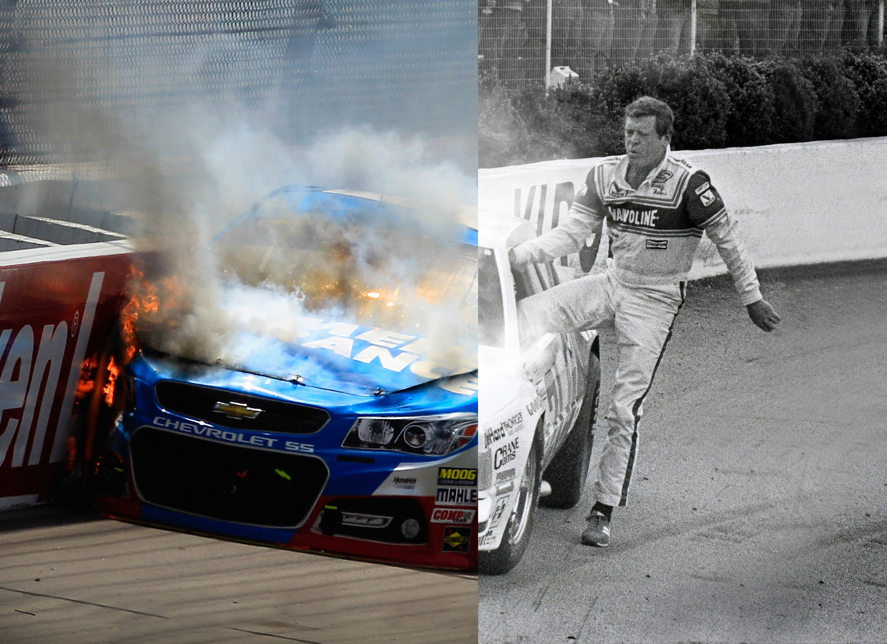
Left panel: a Chevrolet SS engulfed in flame and smoke, modern era, full color. Right panel: a driver in a fire suit walking away from a wrecked Valvoline car decades earlier, black and white. Same moment, different eras, one image.
The sport had a perception problem running in two directions. Outsiders thought it was stuck in the past. The base was wary of anything that felt like the sport apologizing for itself.
The split answers both at once. The cars, the technology, the era have changed completely. The danger, the nerve, and the walk away from a burning car have not changed at all. Longtime fans see continuity. New viewers see something modern and dangerous. One layout, two audiences, no compromise.
It also earns its media. A split-panel image is built for wide out-of-home, which is where it ran.
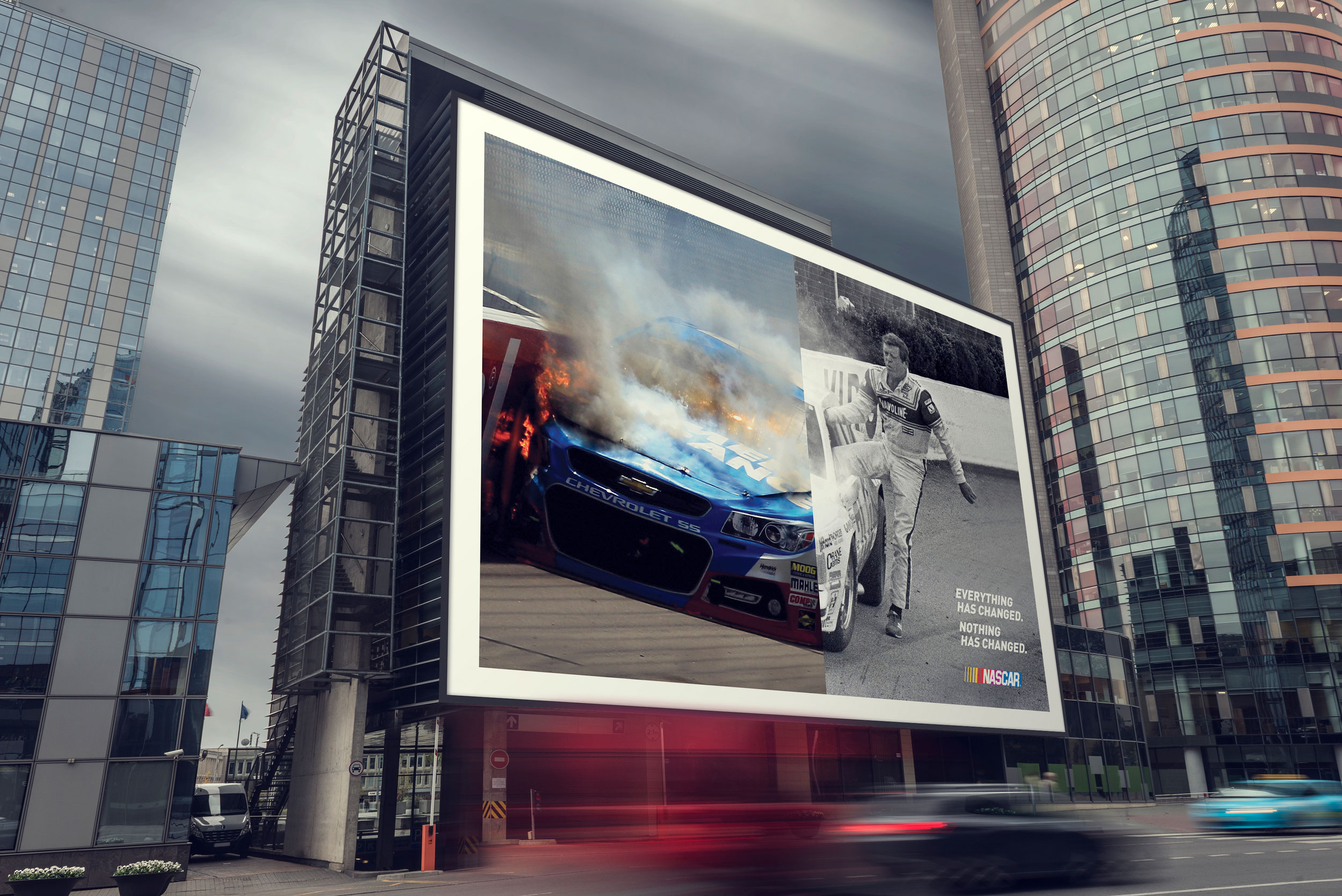
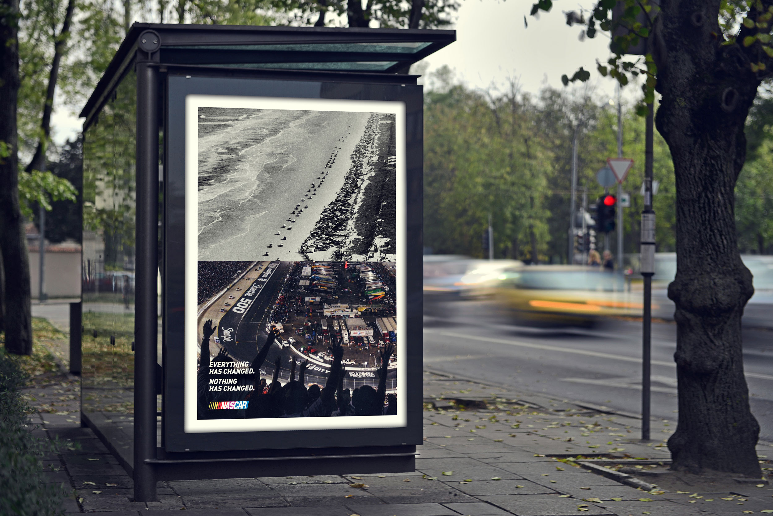
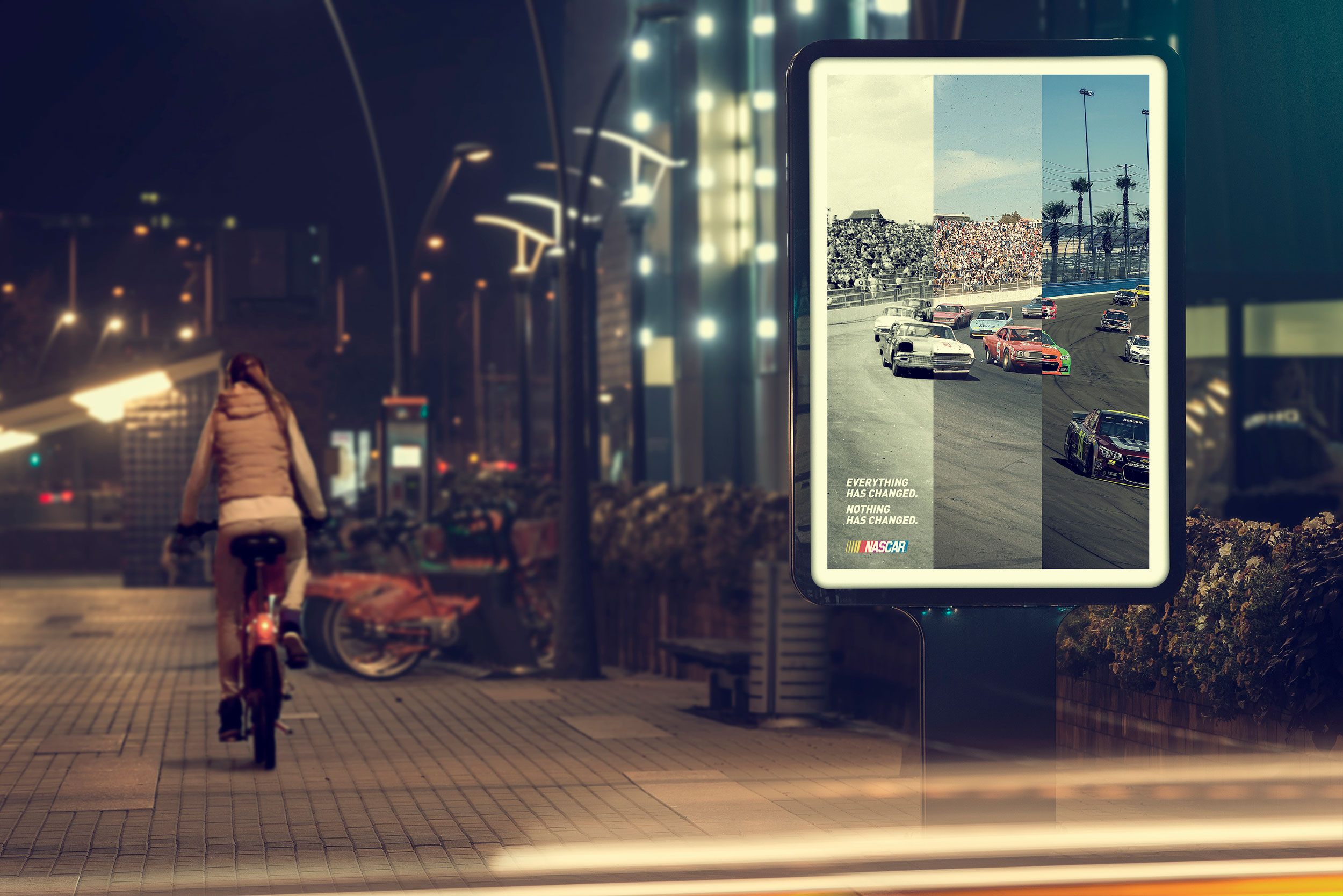
I led all out-of-home artwork and contributed to the flagship TV spot. The campaign won a Gold Clio in 2015, and the out-of-home is permanently installed in the NASCAR Hall of Fame.
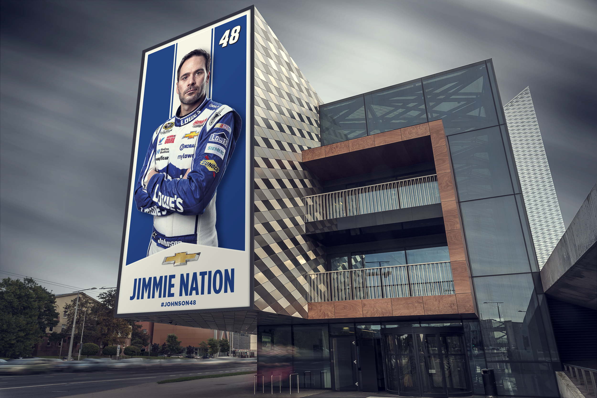
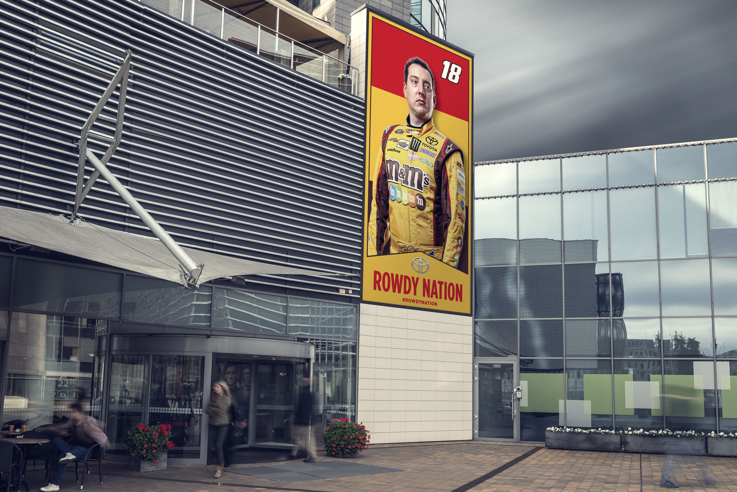
So we named it. Each driver's following became a Nation, with a flag and a hashtag. JIMMIE NATION, number 48, #JOHNSON48, arms folded in Lowe's blue against a matching field.
Built as tall vertical formats so it reads as a banner or a standard. That is the point. Fandom as something you declare rather than something you feel.
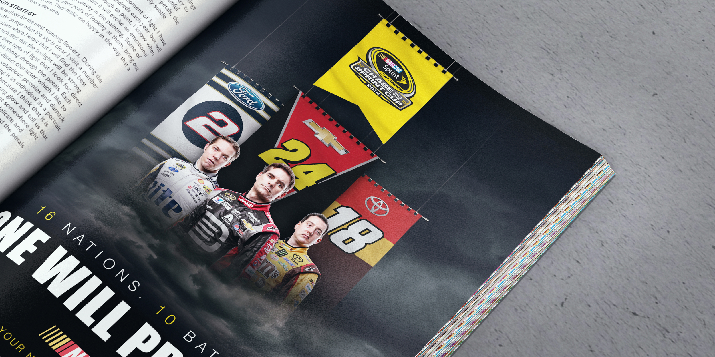
The premise: if a driver is going to win the hardest championship in the world, he is going to need a few things. Fans submitted what they thought those were.
This is where the campaign stopped talking and started listening. Navigation, content modules, a submission flow, social integration, a four-step participation path, and a follow module. Not a campaign microsite. A product.
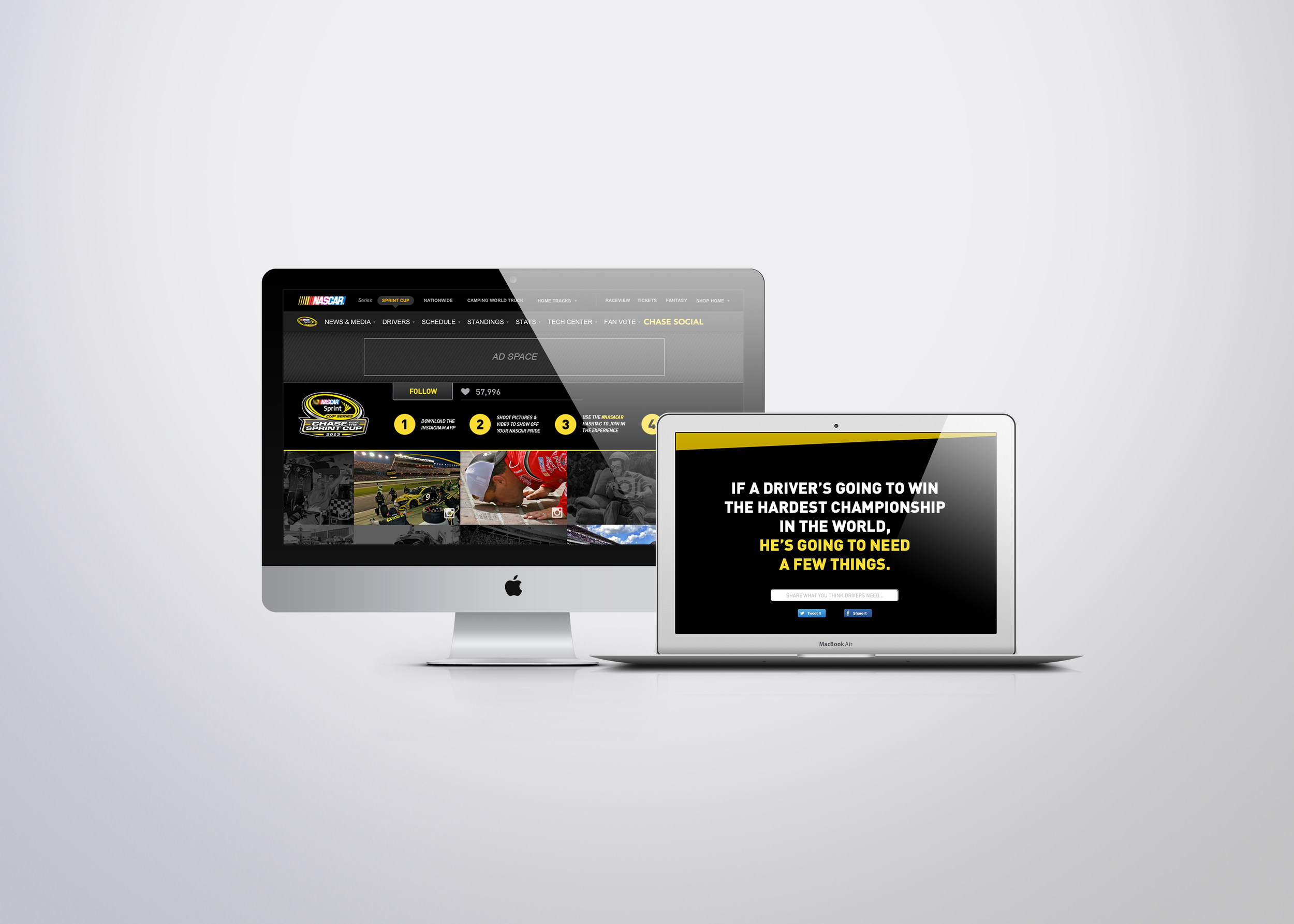
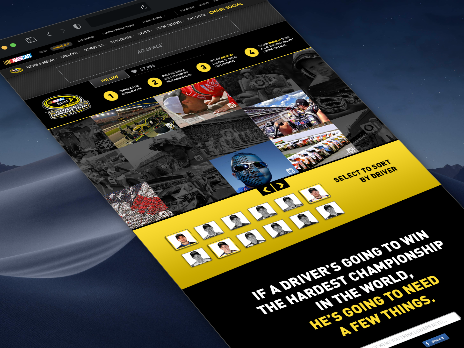
This was my first project after being promoted to Art Director.
The sport needed an identity that could hold at both ends of an unusual range. Track signage is read at two hundred miles an hour, from a grandstand a quarter mile away, and again on broadcast where it is a background element in a shot nobody framed for it. A banner ad is read at arm's length, in a column two hundred pixels wide, by someone trying to leave. The same identity has to survive both.
The work covered track signage, event materials, and print and digital advertising, with a microsite delivering the system itself: a brand book you could navigate rather than a PDF nobody opens.
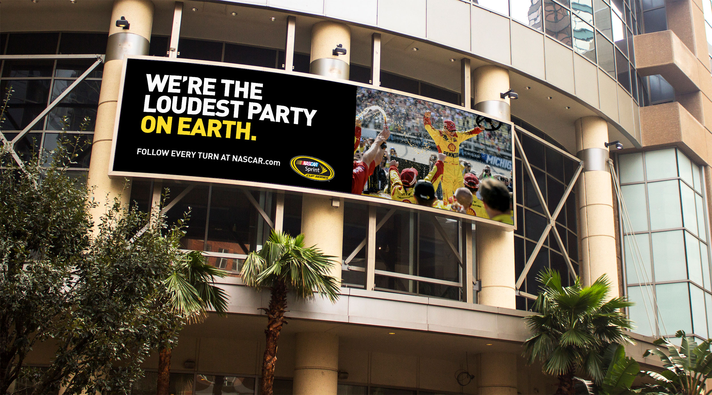
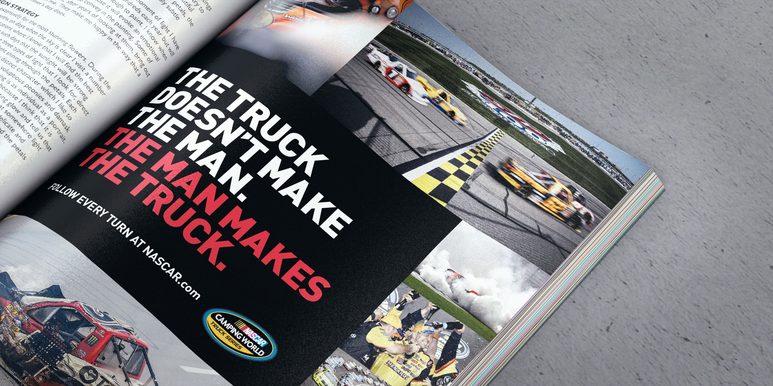
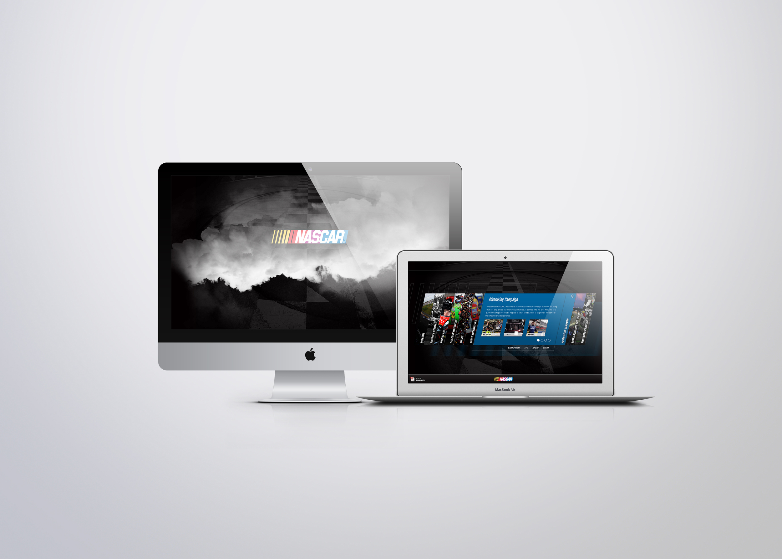
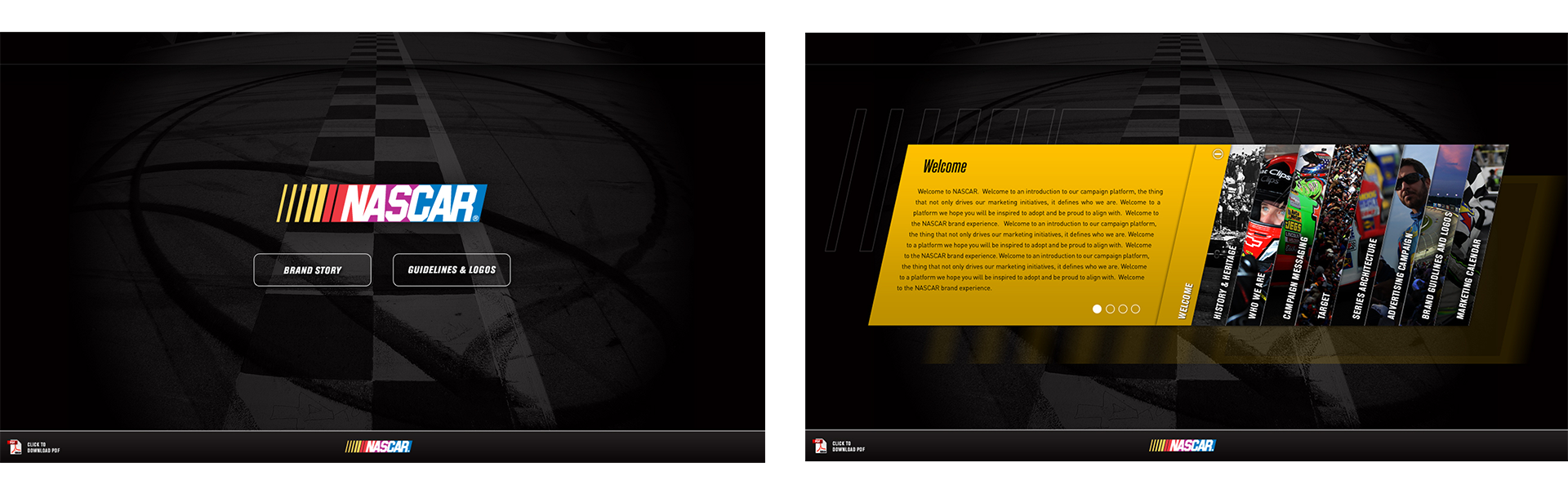
Building the guidelines as a site rather than a document was the right call for an organization with that many partners, tracks, and licensees touching the brand. People use what they can find.
I joined OgilvyEntertainment as an intern in 2012. Within two months I was full time, and the presentation work I was doing contributed to the pitch that won NASCAR as the agency's first entertainment agency-of-record account.
%402x.svg)