UPS moved boxes. The business it wanted was consulting: supply chain design, logistics, global expansion. The previous line, We Love Logistics, described what UPS did rather than what a customer got.
The audience was senior decision-makers at small and mid-market companies, who are hard to reach and immune to category advertising. They do not want to hear about your fleet.
Stop selling package shipping. Start selling problem solving.
Reframe 400,000 employees not as drivers but as people who fix things for a living. The campaign line was the strategy stated plainly.
Ogilvy put more than ten creatives in a room, each presenting multiple directions. Mine was chosen.
The whole thing had to be designed, selected, and in market in about a month.
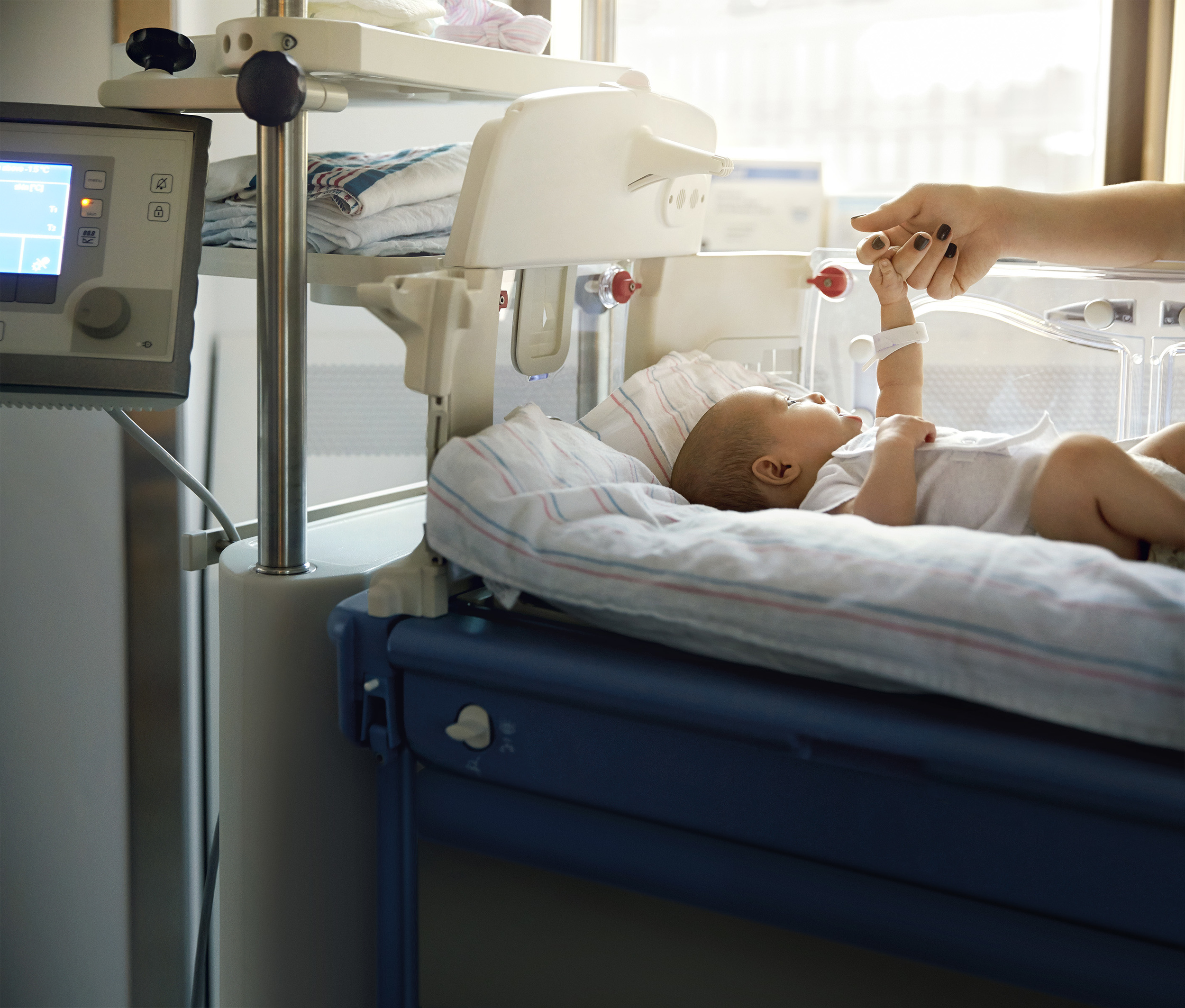
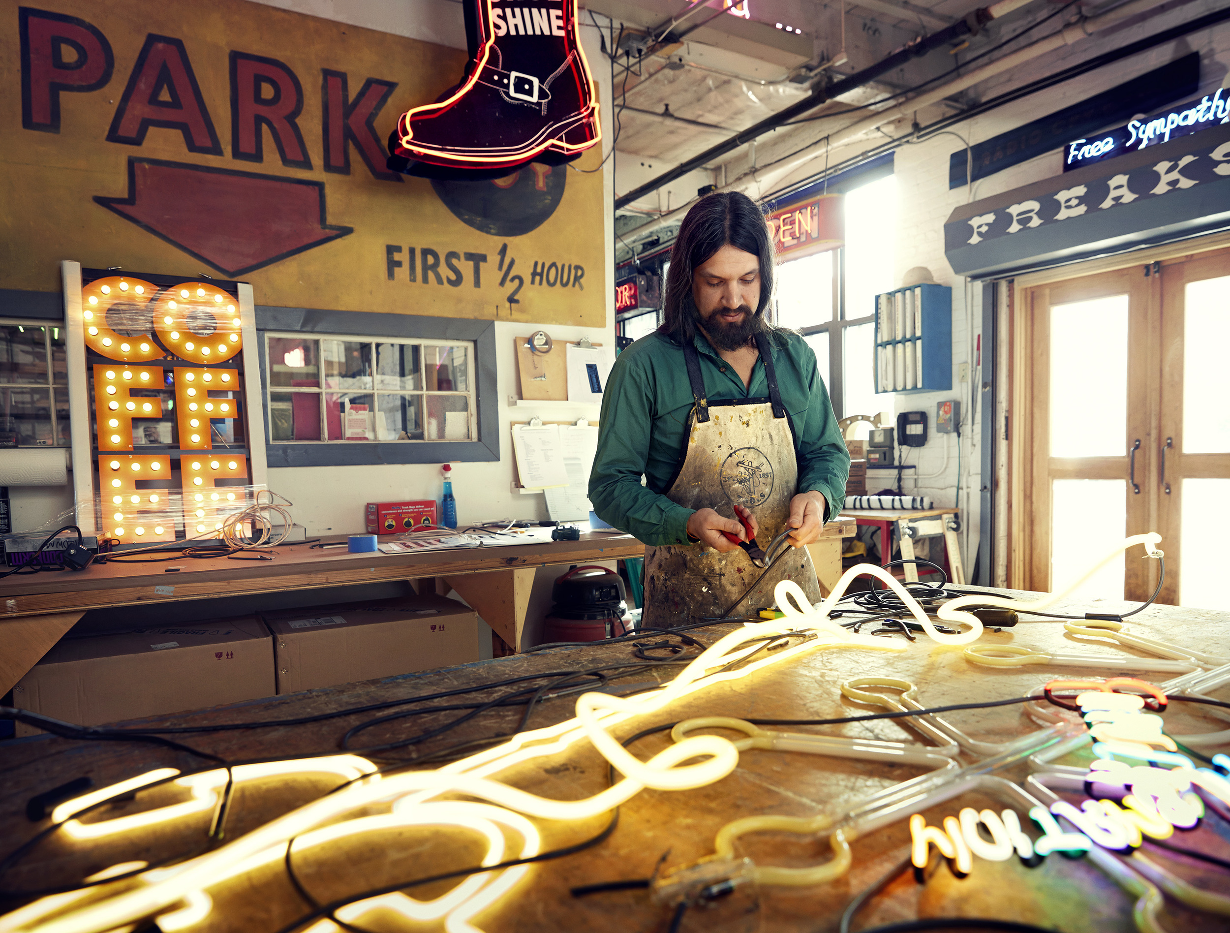
The photography does the strategic work before a word is read. What UPS moves is not a package, it is a vaccine that has to stay cold, a neon sign a small shop needs by Friday, a business that will not exist next quarter without it. Show the customer's world, never the truck.
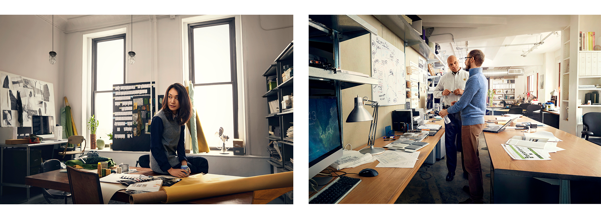
Winning the review meant owning the rollout. I expanded the system across TV, digital, print, and out-of-home, then onboarded UPS's international markets on how to use it: I wrote the guidelines and walked market teams through the system directly, so work could be produced locally without drifting from the platform.
The system had to survive being handed to teams I would never meet. Regional offices in the UK and Germany filmed their own local customer stories inside it, and the work still read as one campaign. Two of the three Effies came from the UK.
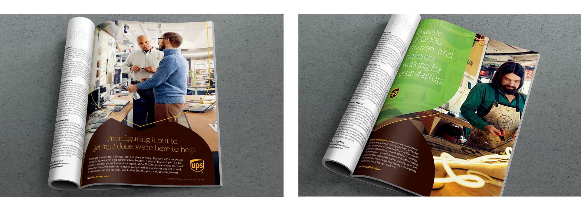
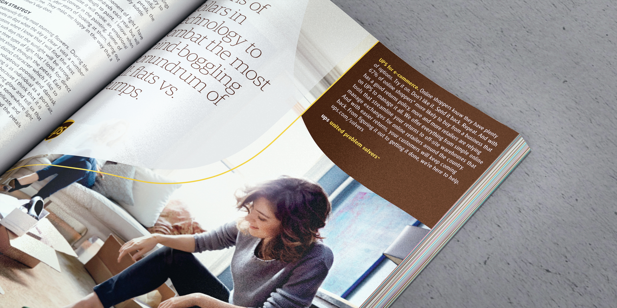
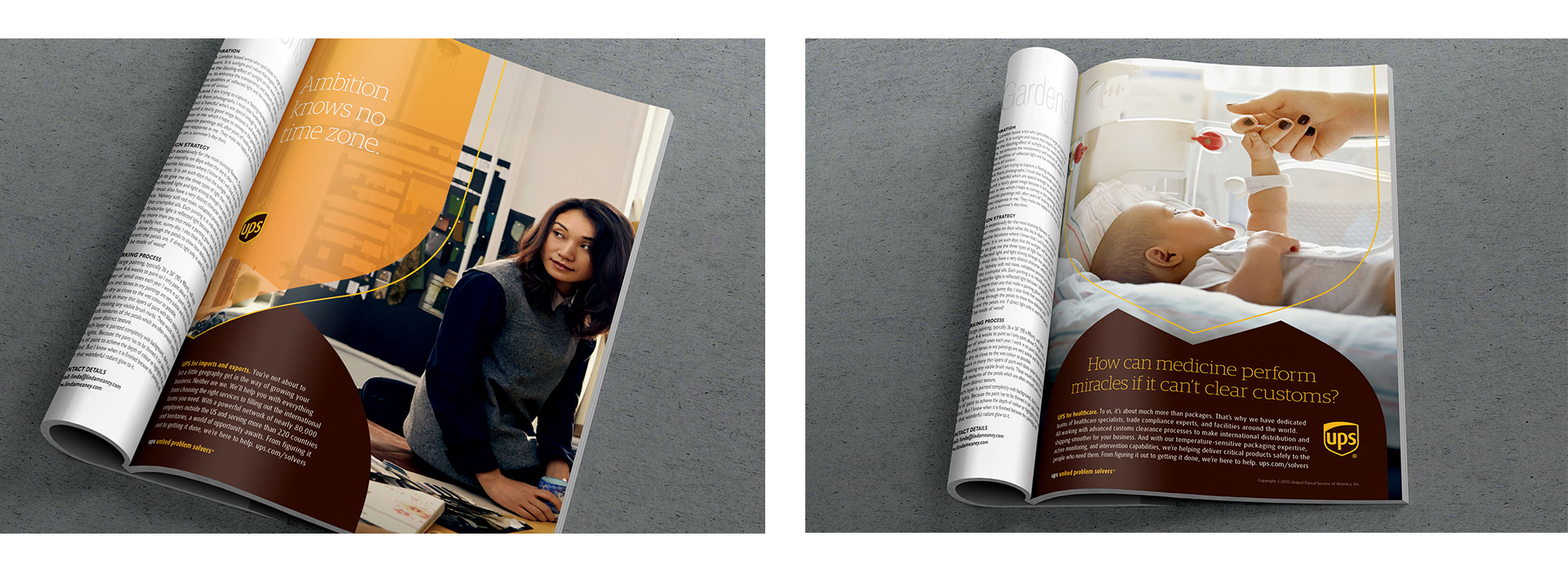
One spread pairs the neon shop with a line about imagining 400,000 thinkers and tinkerers working for your startup. That is the platform doing its job in a single sentence.
The campaign needed somewhere to land. Print and broadcast could make the argument, but a business owner who believed it had to be able to do something next.
So the platform became a site.
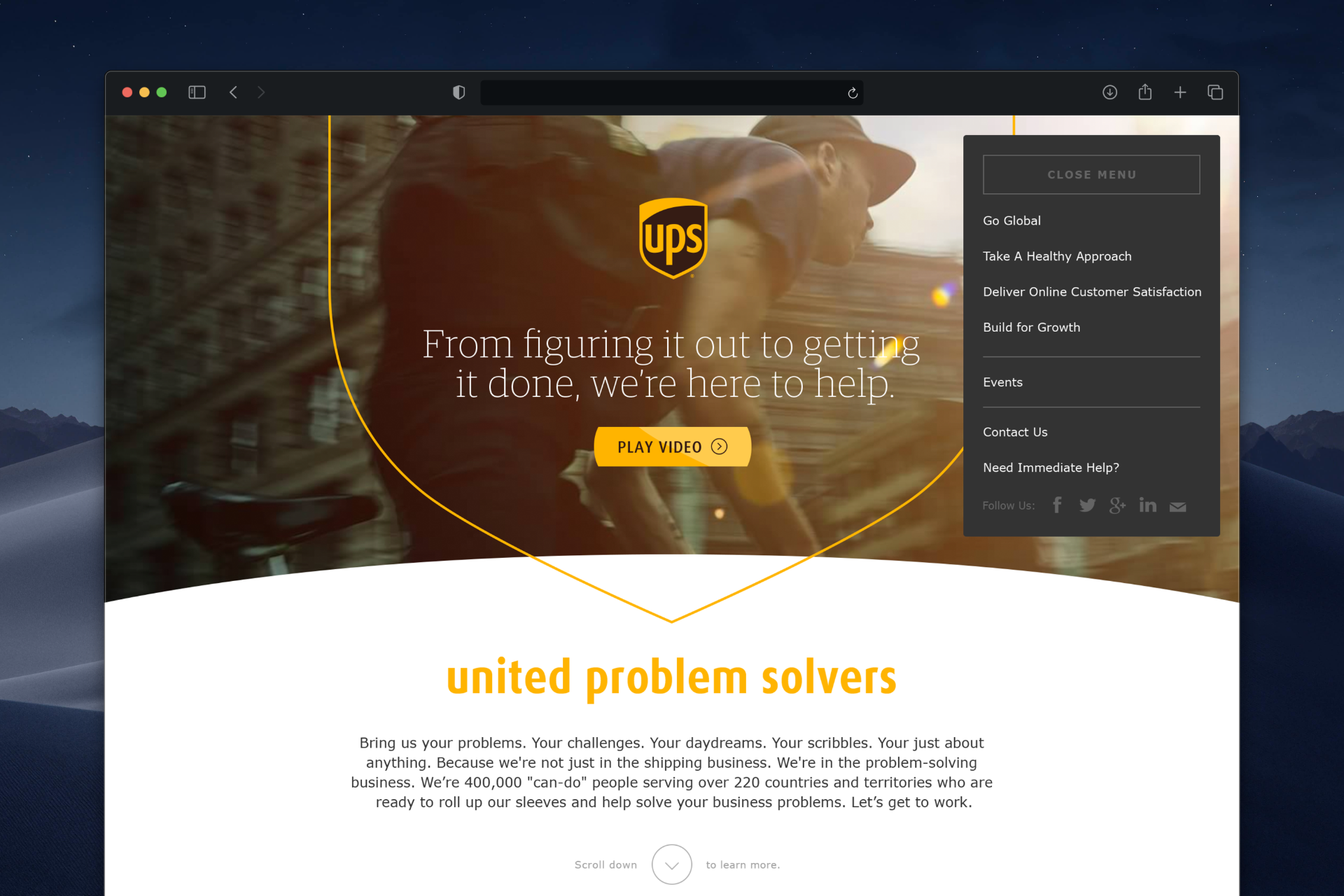
The hero uses the UPS shield as structure rather than decoration: the outline frames the video, and the curve of the shield becomes the divider between sections all the way down the page. It is the identity system doing load-bearing work in an interactive context, which is a harder test than a print layout.
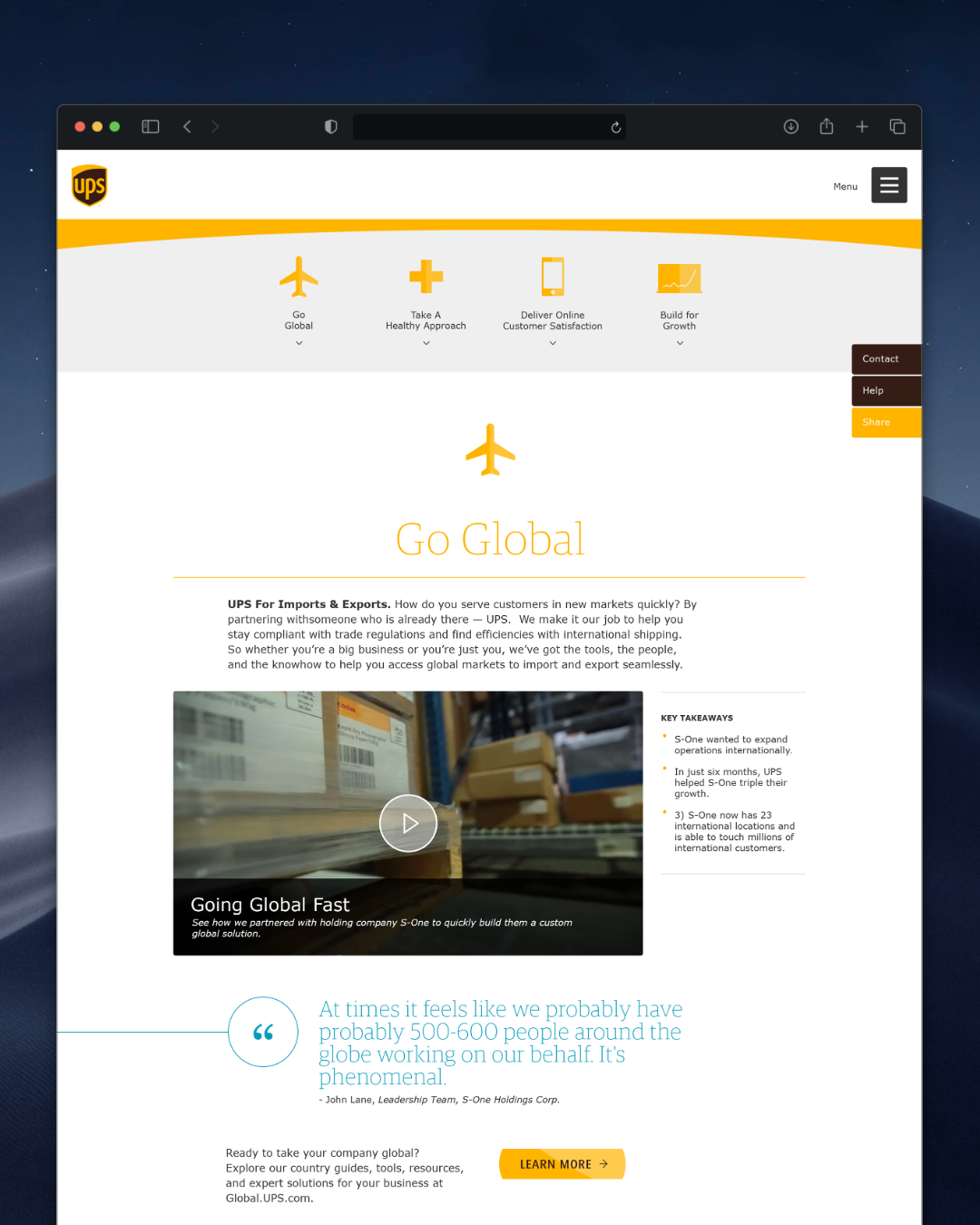
Four problems a growing business actually has, each with a persistent sub-navigation and an accordion so nobody has to scroll past what they do not need.
Inside each pillar, one repeatable content module: the problem stated plainly, a customer film with Key Takeaways pulled alongside it, a quote from the customer, and a single next step. Same structure every time, so the content team could fill it without me.
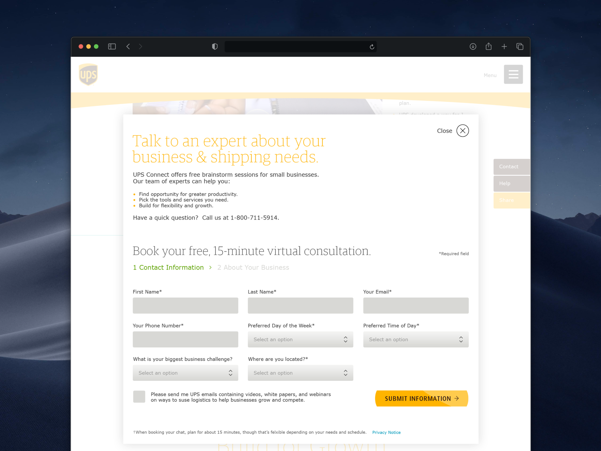
The conversion point is a free fifteen-minute consultation, and the form is split into two steps with a progress indicator: contact information first, business detail second. Ask for the easy things before the qualifying ones. It is a small decision that meaningfully changes completion rates.
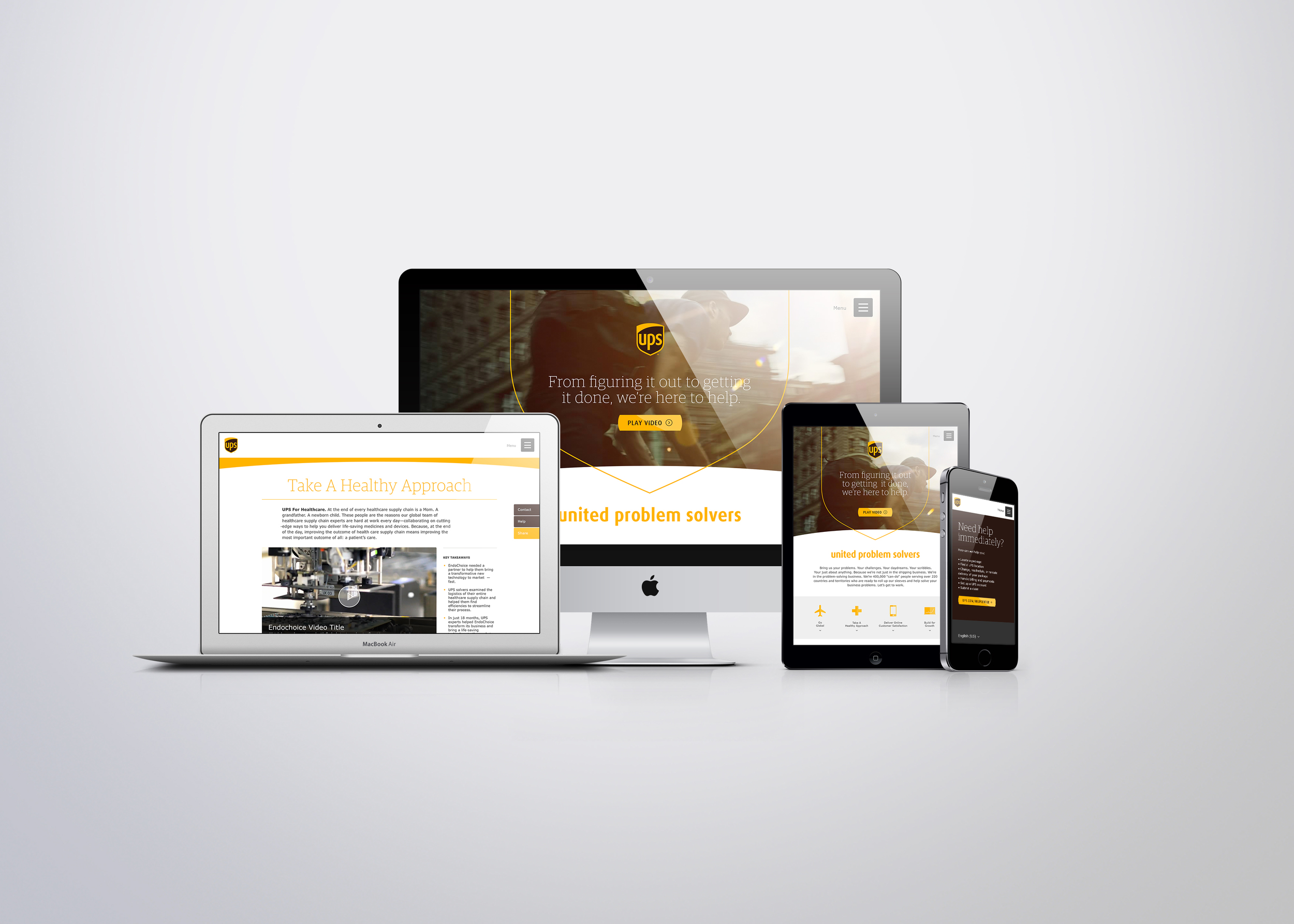
The whole thing is responsive. The four-pillar bar collapses to a stacked accordion, the Key Takeaways sidebar reflows beneath the video, and the quote holds its scale rather than shrinking to fit. Designed in 2015, when responsive was still something you argued for.
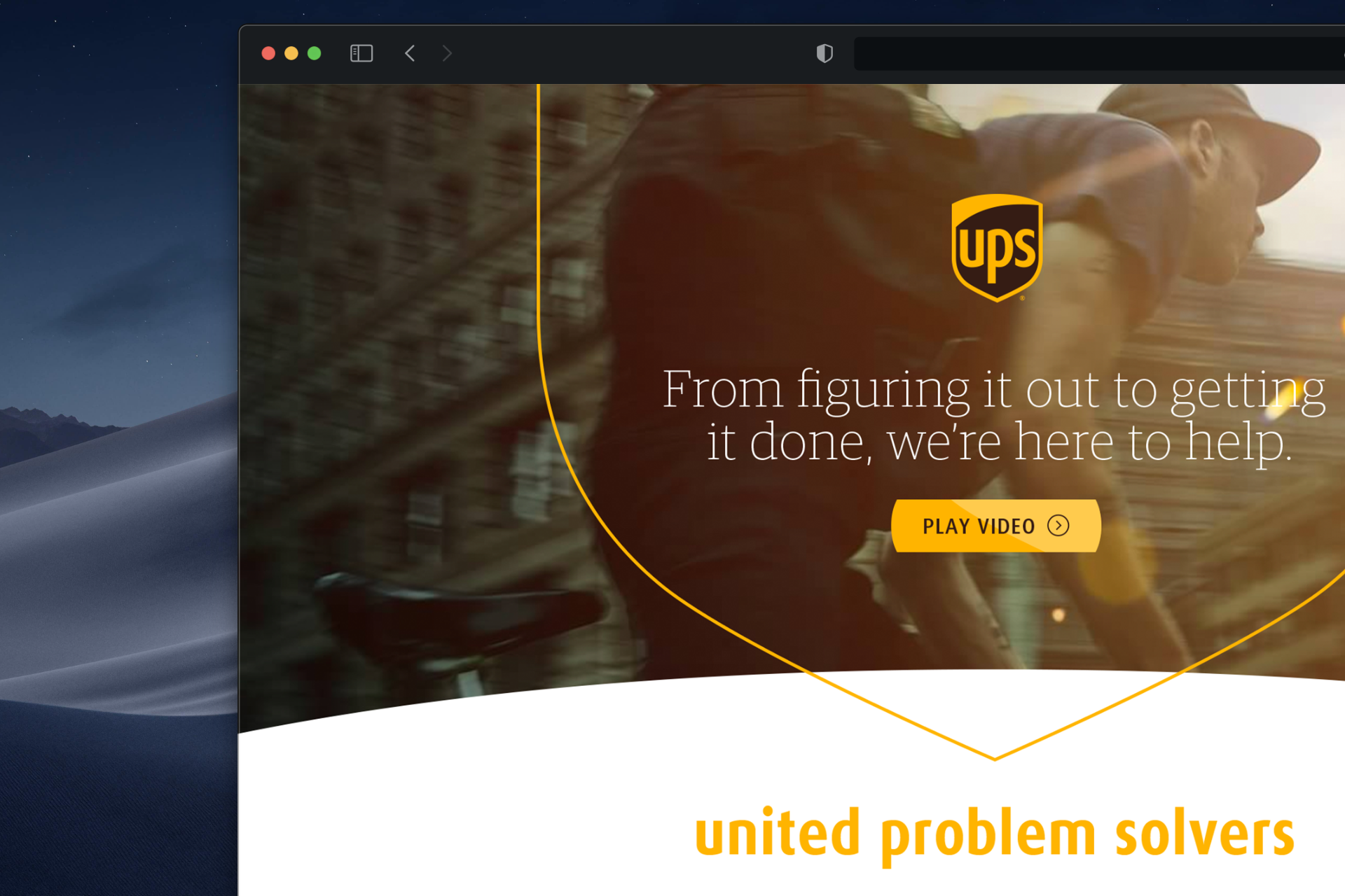
These were the final files handed to development: every state specified, every breakpoint resolved, nothing left for someone else to interpret.
I also directed photographers across multiple campaign shoots, and on the film side I ran post, managing final edit and color grading across the video work.
The platform said UPS solves problems. This is the one where the solving was the campaign.
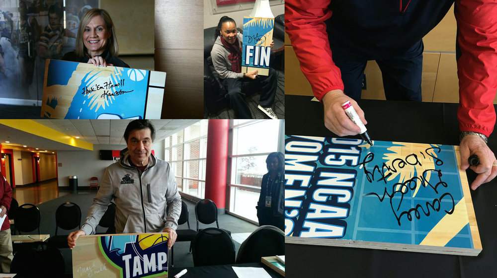
We built a replica NCAA Final Four court, got every coach in the tournament to sign a piece of it, and had UPS ship those pieces to Indianapolis and Tampa to be reassembled on site for the 2015 Men's and Women's Final Fours. Then the pieces went to auction with eBay, raising a few hundred thousand dollars for cancer research.
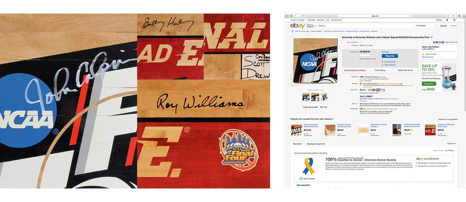
The auction ran with eBay and benefited Coaches vs. Cancer, the American Cancer Society program run with the National Association of Basketball Coaches. John Calipari's Kentucky piece drew 24 bids. Krzyzewski's Duke section went for $515. A hundred percent of every sale went to the charity.
A documentary-style film launched it, featuring Dawn Staley, Muffet McGraw, Mike Brey, and Scott Drew.
It ran in the same window as the platform launch. United Problem Solvers debuted during March Madness because the tournament reaches senior decision-makers. Courts for a Cause is what the brand did once it had their attention.
The reason it works is that the logistics are the idea. Most cause marketing bolts a donation onto a campaign. Here the thing UPS actually does, moving complicated objects to the right place at the right time, is what made the activation possible at all. The brand is not sponsoring the story. The brand is the mechanism.
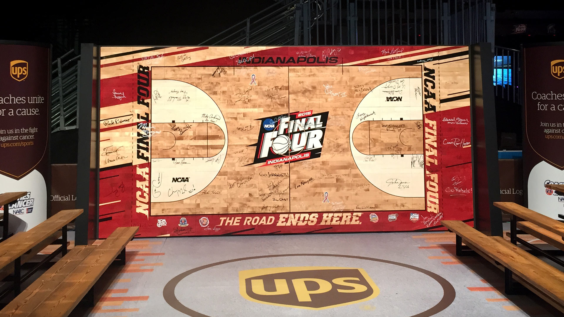
It also extended the identity system into experiential, which is the hardest test a design system faces. A layout can be controlled. A basketball court in an arena cannot.
I was the art director on the account and owned the brand assets across the activation: the environmental graphics, the auction and social assets, and the system holding all of it to the platform.
The campaign launched in March 2015, debuting during the NCAA tournament for its skew toward senior corporate decision-makers, then rolled into China, Germany, Mexico, and the UK.
%402x.svg)