
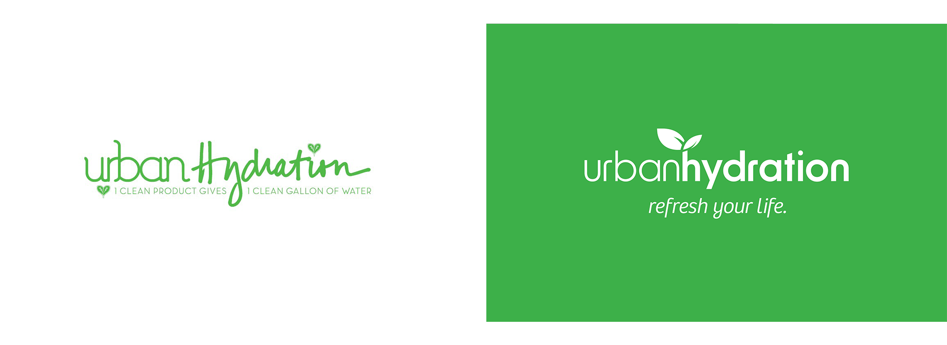
The old identity was a green handwritten script with a leaf sprouting from the H, locked with the line "1 clean product gives 1 clean gallon of water." Packaging ran illustration-led and category-specific: teal spray bottles, hand-drawn figures, script product names like "Breath of Fresh Hair."
It was warm and it had genuine personality. What it did not have was a system. Each product line looked like its own brand, the script did not scale down, and there was no architecture that could carry skincare, haircare, and bath and body without redesigning each one.
For a brand with hospital distribution and national retail, the packaging was working against the credibility the business had already earned.
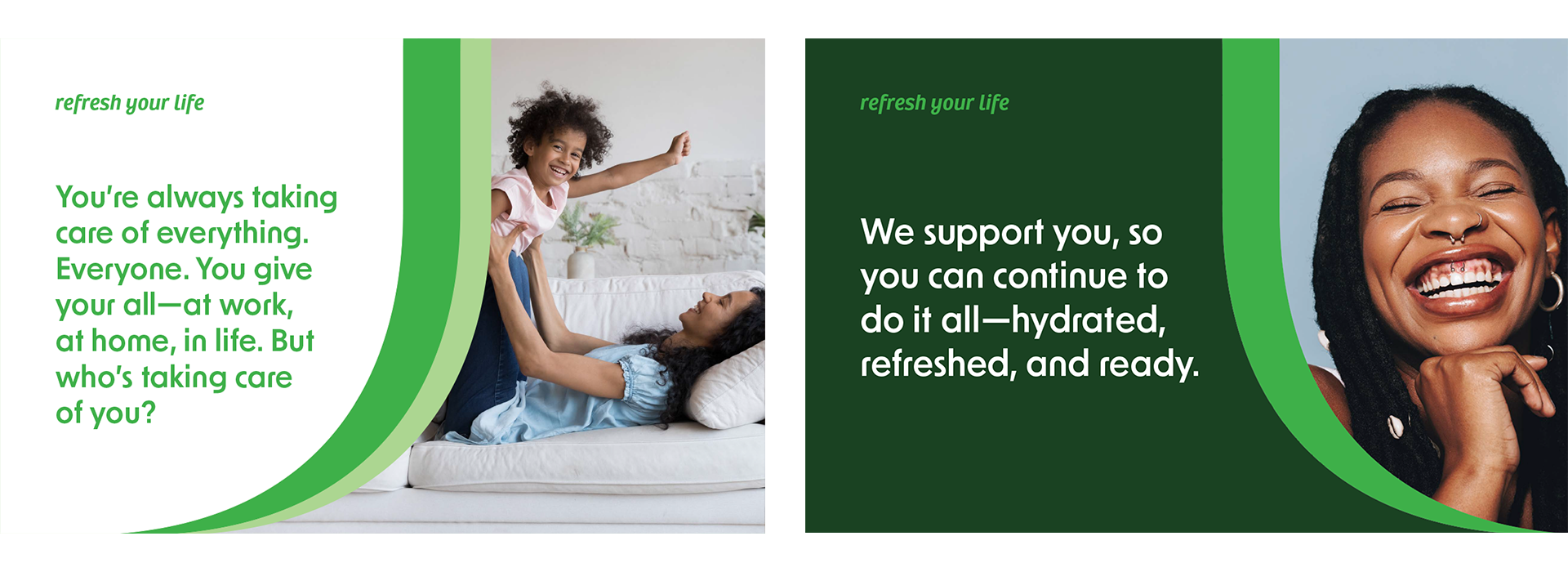
Urban Hydration's customer takes care of everyone. At work, at home, in her community. She is the person other people rely on.
Which means self-care reads to her as one more thing she does not have time for, or worse, as selfish. That is the actual barrier, and it is not solved by talking about ingredients.
The founder, Psyche Terry, had the right idea inside six words. My job was to find the three that carried it.
Refresh Your Life.
The manifesto resolves the tension rather than ignoring it. You give your all, so let us help you recharge. When you take care of yourself, you can take care of the world around you. And every purchase provides clean water to communities in need through the brand's WATERisLIFE partnership.
That last move is the one that matters. Most purpose-driven beauty brands staple the donation onto the end. Here it closes the emotional loop the manifesto opened: self-care becomes an act of care for others, not a contradiction of it.
Empower yourself. Hydrate your skin. Lift up others.

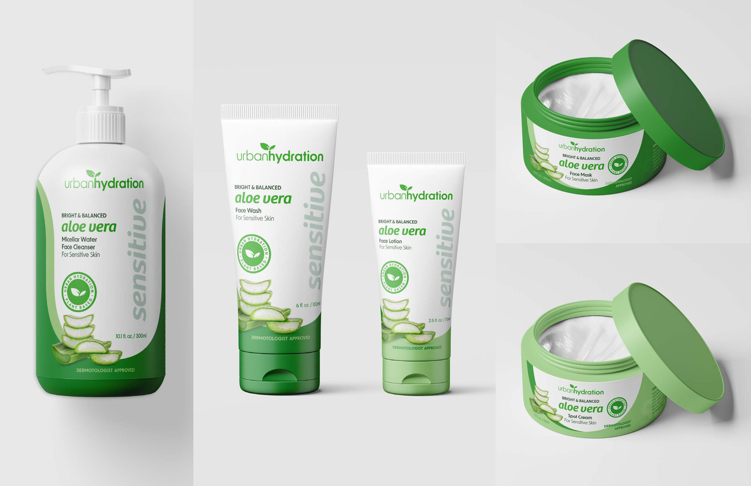
I designed a complete new brand identity, including a new logo, and a packaging architecture that runs across five formats: pump bottle, two tube sizes, and two jars.
White-to-green gradient, sliced aloe running up the lower half, a vertical descriptor down the right edge, a botanical seal. The structure flexes to any ingredient line without redesigning anything, which is the actual test of a packaging system.
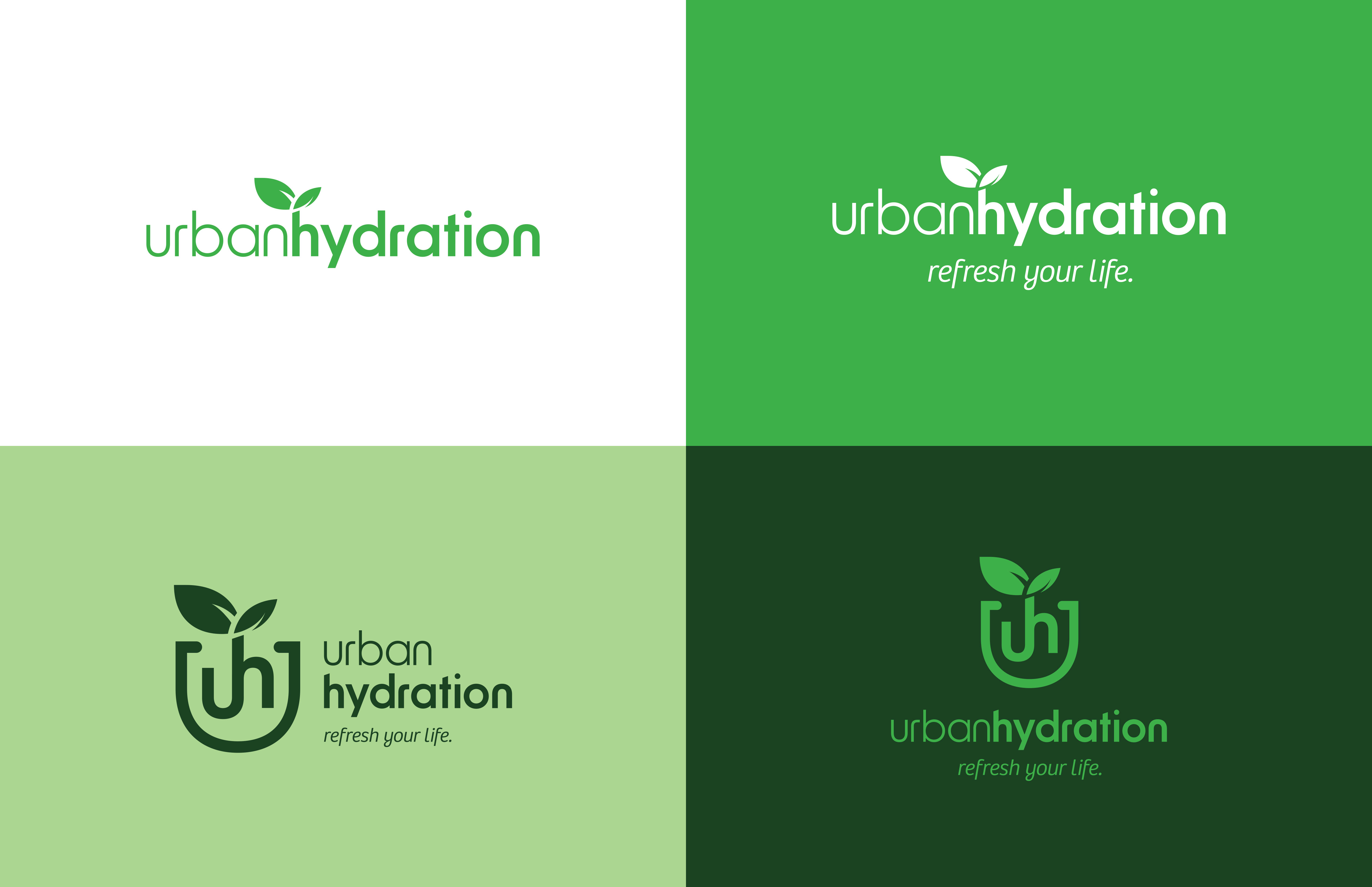
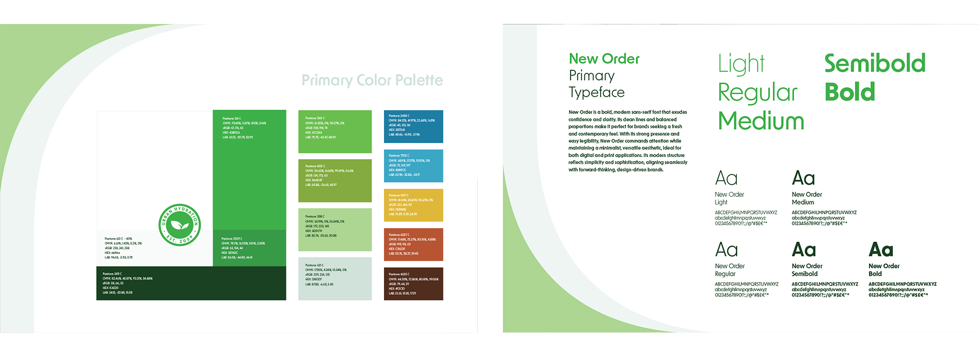
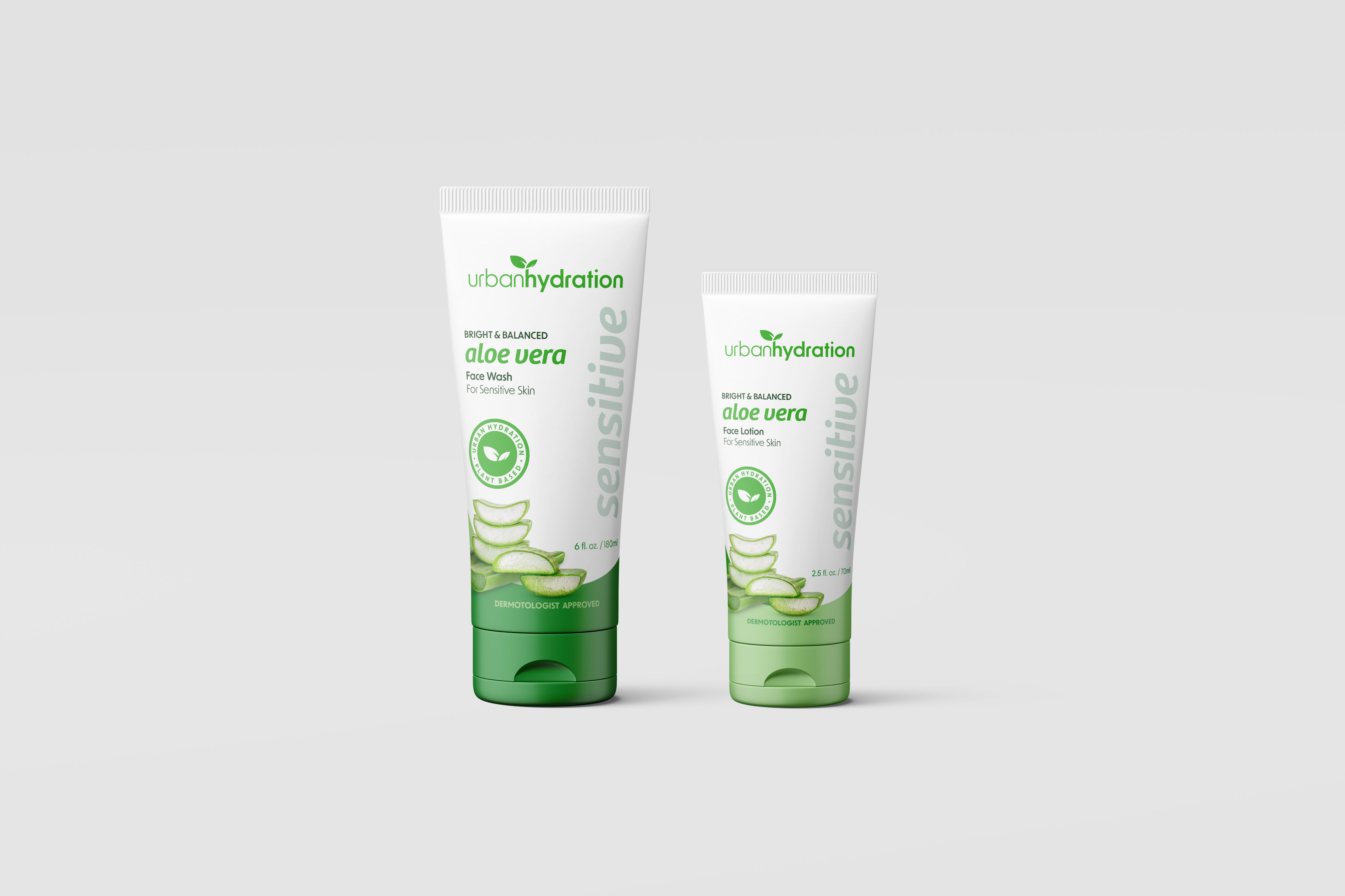
The guidelines had to work for people I would never meet: a content team, a packaging vendor, a retail partner. So alongside the identity I designed how the brand's language and content priorities were organized and presented.
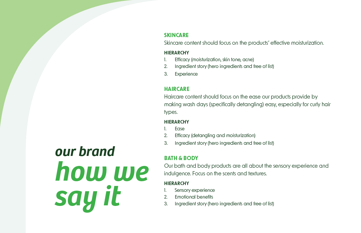
Skincare leads with efficacy. Haircare leads with ease, because wash day is the problem. Bath and body leads with sensory experience. Three hierarchies rather than one flat voice guide, laid out so someone can find their category and start writing.
The vernacular is the brand's own, built up with its community over years. What I built was the structure that made it usable.
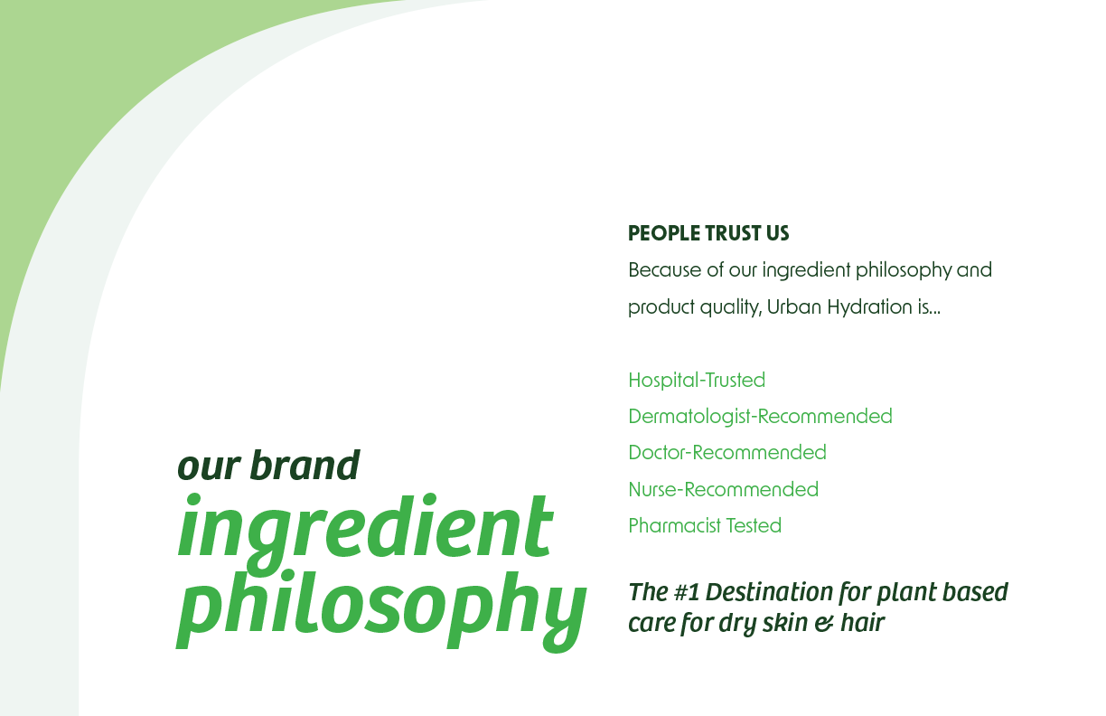
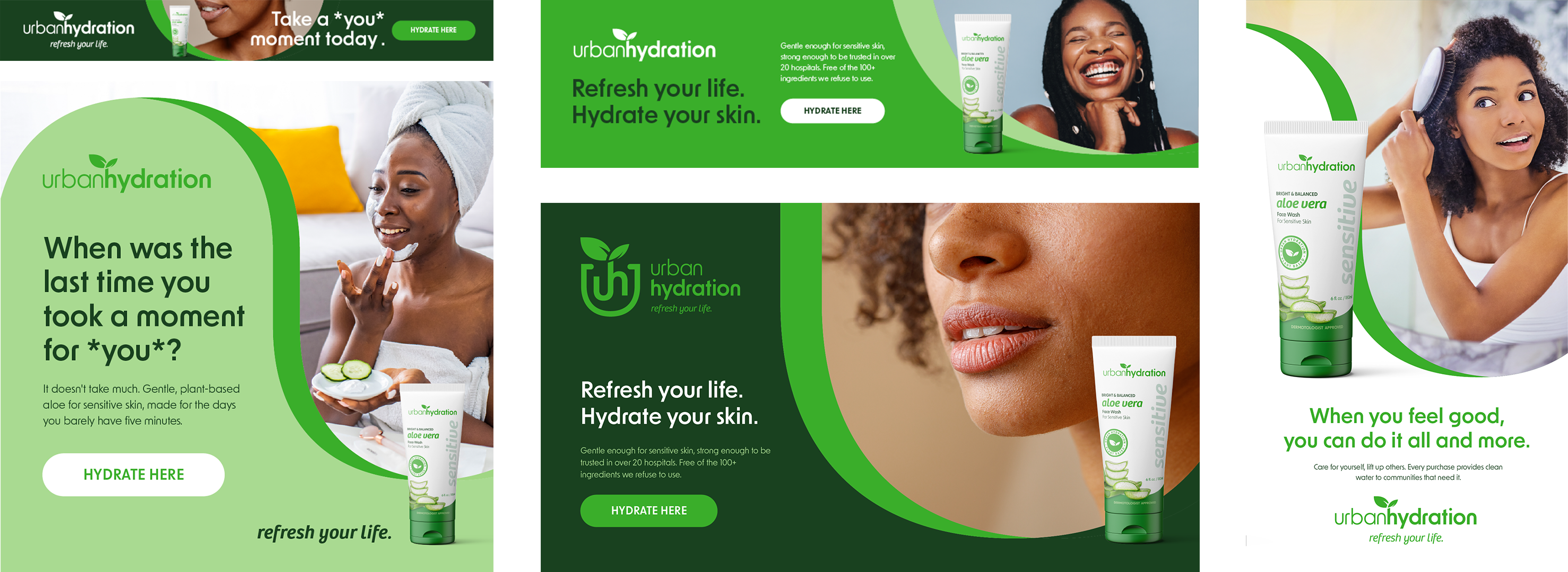
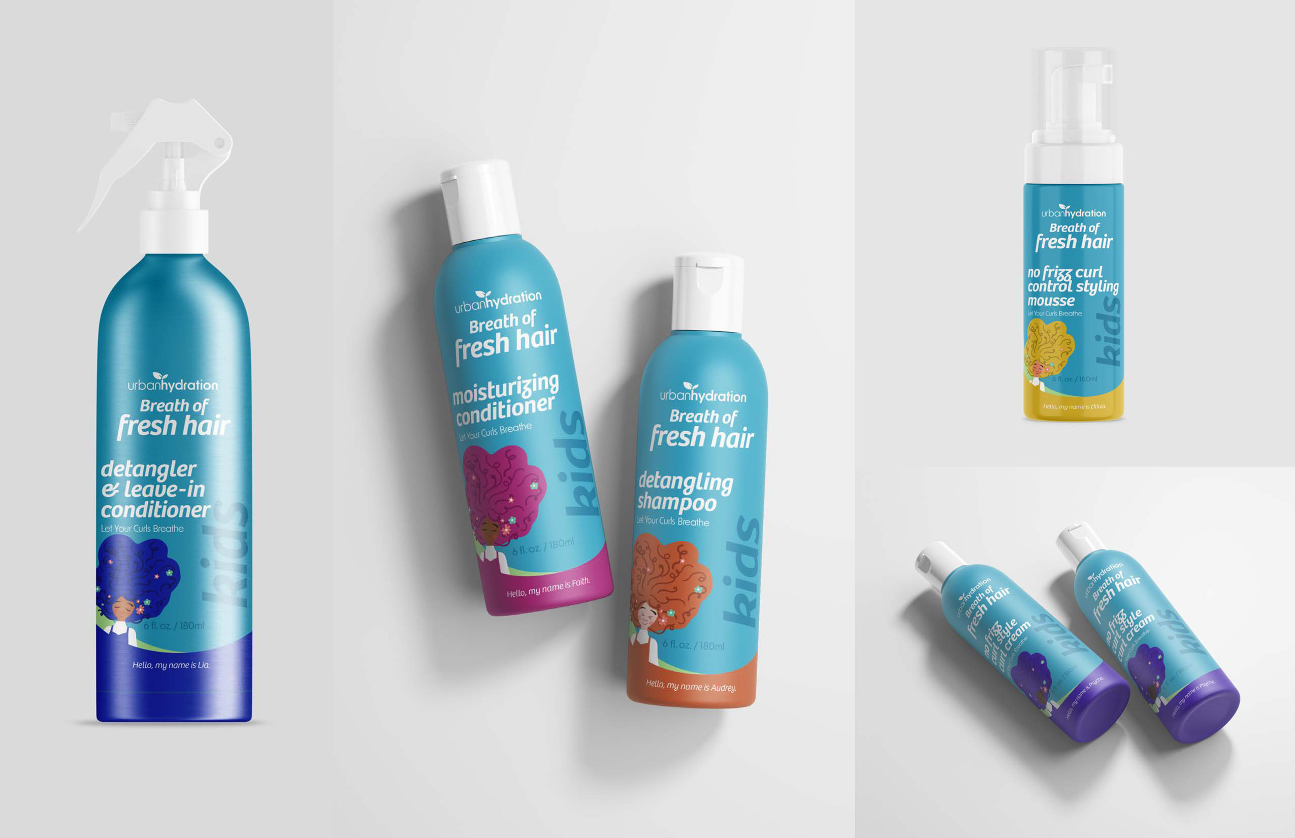
Urban Hydration is an established brand with a founder story, a water partnership, and a customer vernacular that predates this work. I evolved the strategy rather than replacing it, sharpened the positioning around a single audience tension, and designed the identity and system that could carry it across categories.
%402x.svg)