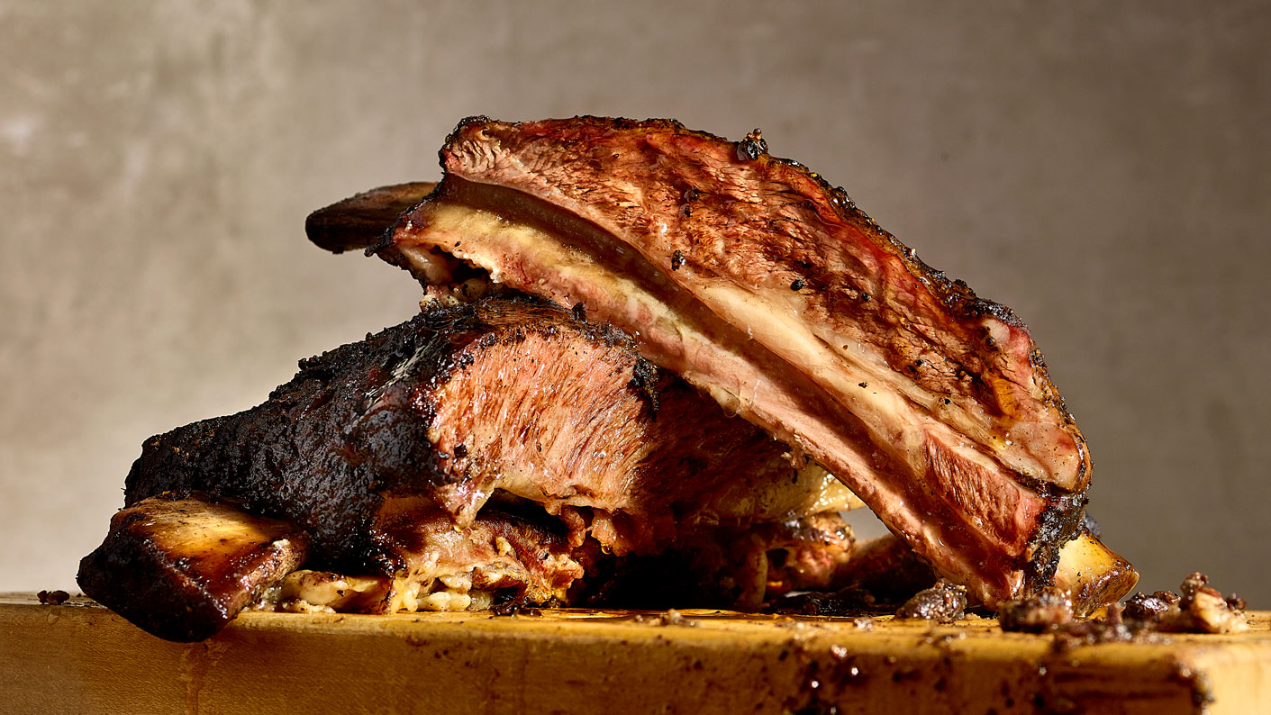
Tender Smokehouse was growing toward five locations with something most restaurant brands do not have: an actual position. Faith, family, community, and craft, meant literally. They close Sundays and Mondays so staff can rest. They run a Homeless Menu.
What they did not have was a system to carry any of it. Growth without governance means five restaurants that look like five different restaurants, and a brand that means whatever the last person to touch it decided.
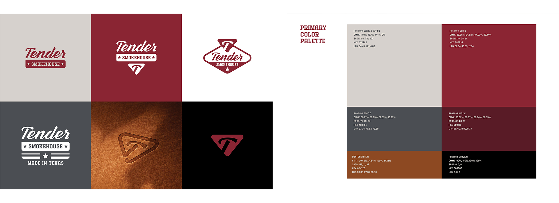
The old identity was a script wordmark in a maroon circle. The menu was a chalkboard layout: rustic type, star dividers, four locations listed in four different colors across the bottom.
Nothing was wrong with it exactly. It just did not say anything. Family Owned Texas Barbecue is a category description, not a position, and a chalkboard menu is what every barbecue restaurant in Texas already looks like. There was no way to tell Tender apart from a competitor two exits down, and no system to keep five locations consistent.
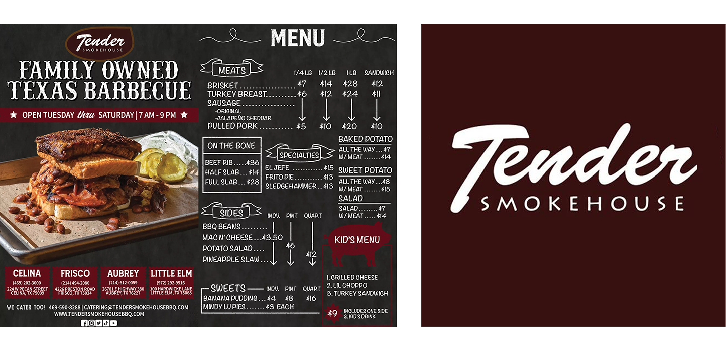
The equity worth keeping was the name and the maroon. Everything else needed a reason to exist.
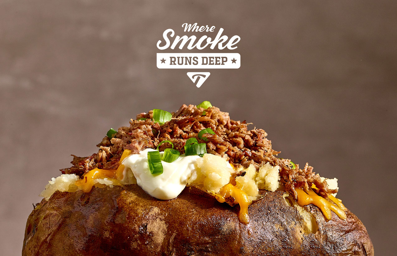
The line works two ways, which is why it works at all. Literally, on smoke ring and time in the pit. Figuratively, on family and roots. Barbecue is one of the few foods where the process and the values are the same story.
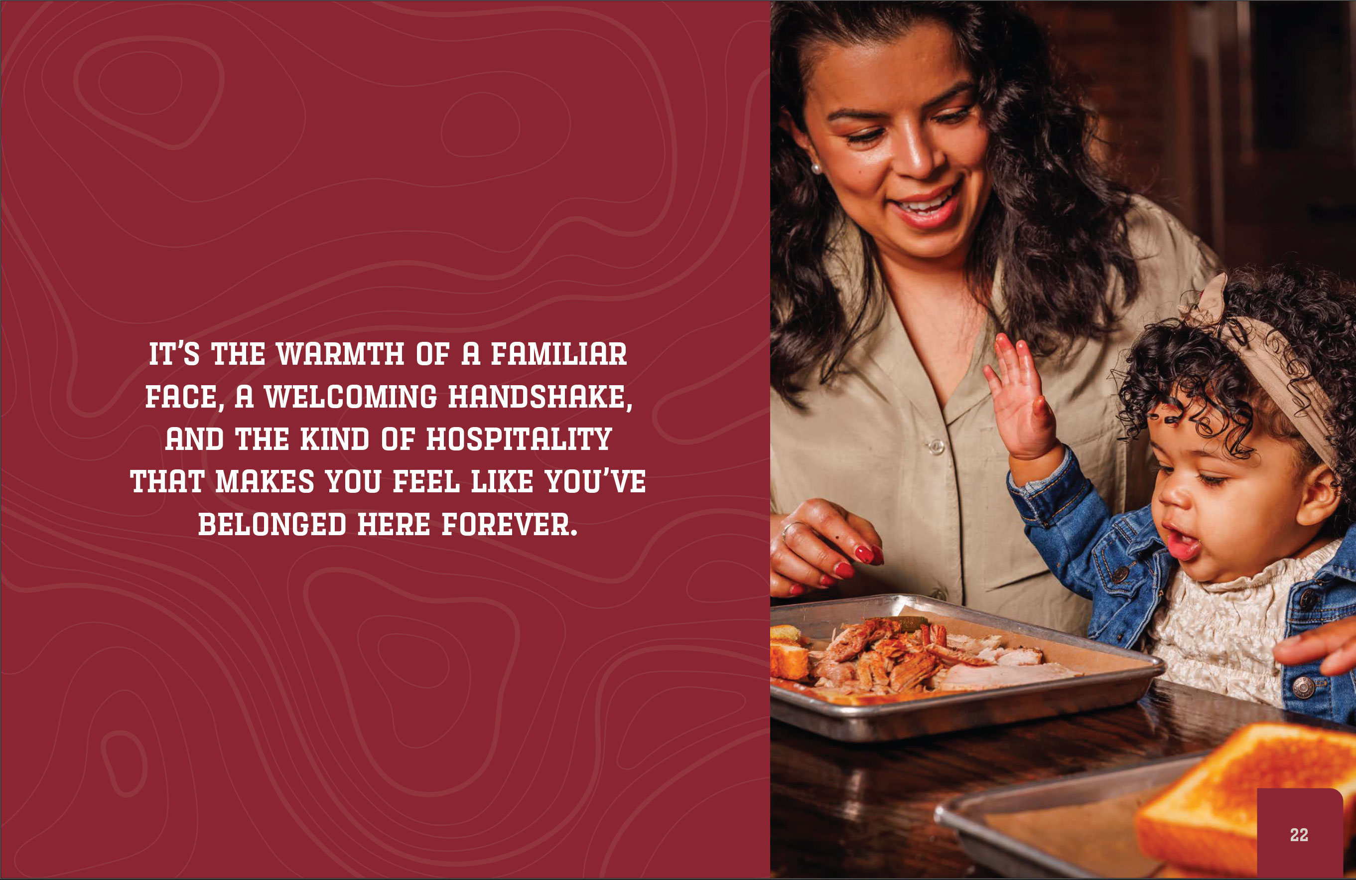
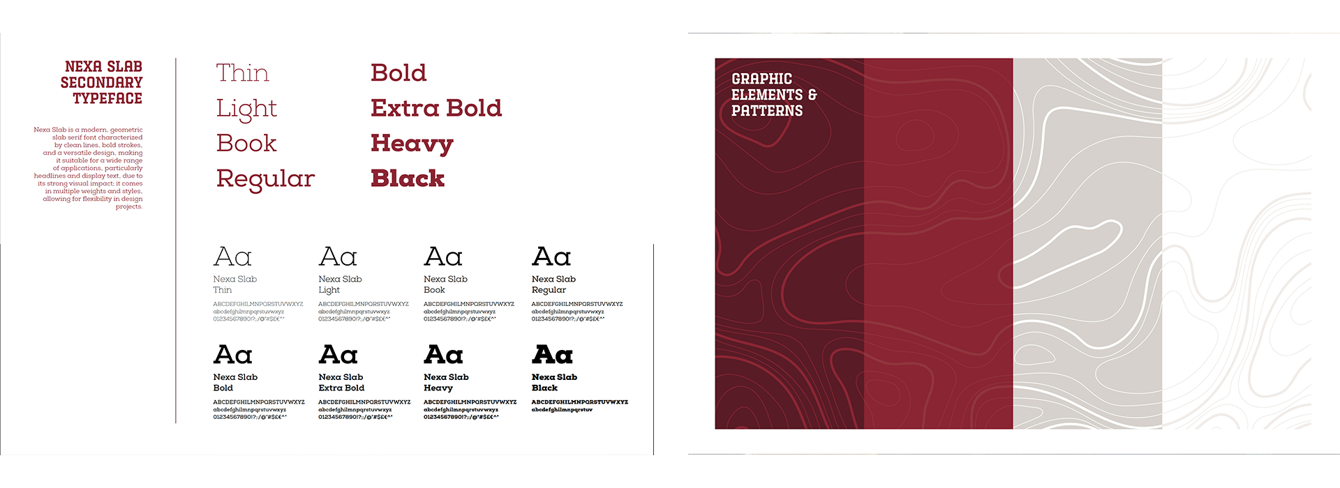
The manifesto runs nine pages and alternates: deep maroon panels carrying copy in condensed slab caps, against full-bleed photography on the facing half, with topographic contour lines running through the maroon as texture. It reads as landscape and as smoke.
The alternation is the argument. Type panel, photograph. Food frame, people frame. The brand's two halves, craft and community, are built into the layout rather than only stated in the copy.
Sections one through five are what you would expect: purpose, core identity, visual identity, photography, and branding assets.
Sections six through eight are the ones that matter. Customer experience and service standards. Partnerships and collaborations. Brand compliance, including approved applications, violations, and an internal and external approval process.
Most brand books stop at color. If a system is going to survive five locations and the people you have not hired yet, it needs to tell someone what to do when a vendor asks for the logo and nobody senior is available.
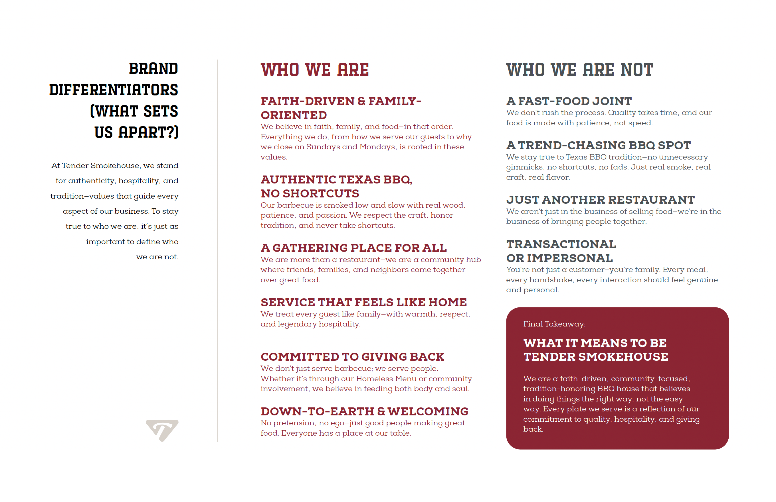
The single most useful page in the book defines the brand by what it refuses to be: not a fast-food joint, not a trend-chasing BBQ spot, not just another restaurant, not transactional. Saying what you are not is faster than saying what you are, and it is much harder to argue with.
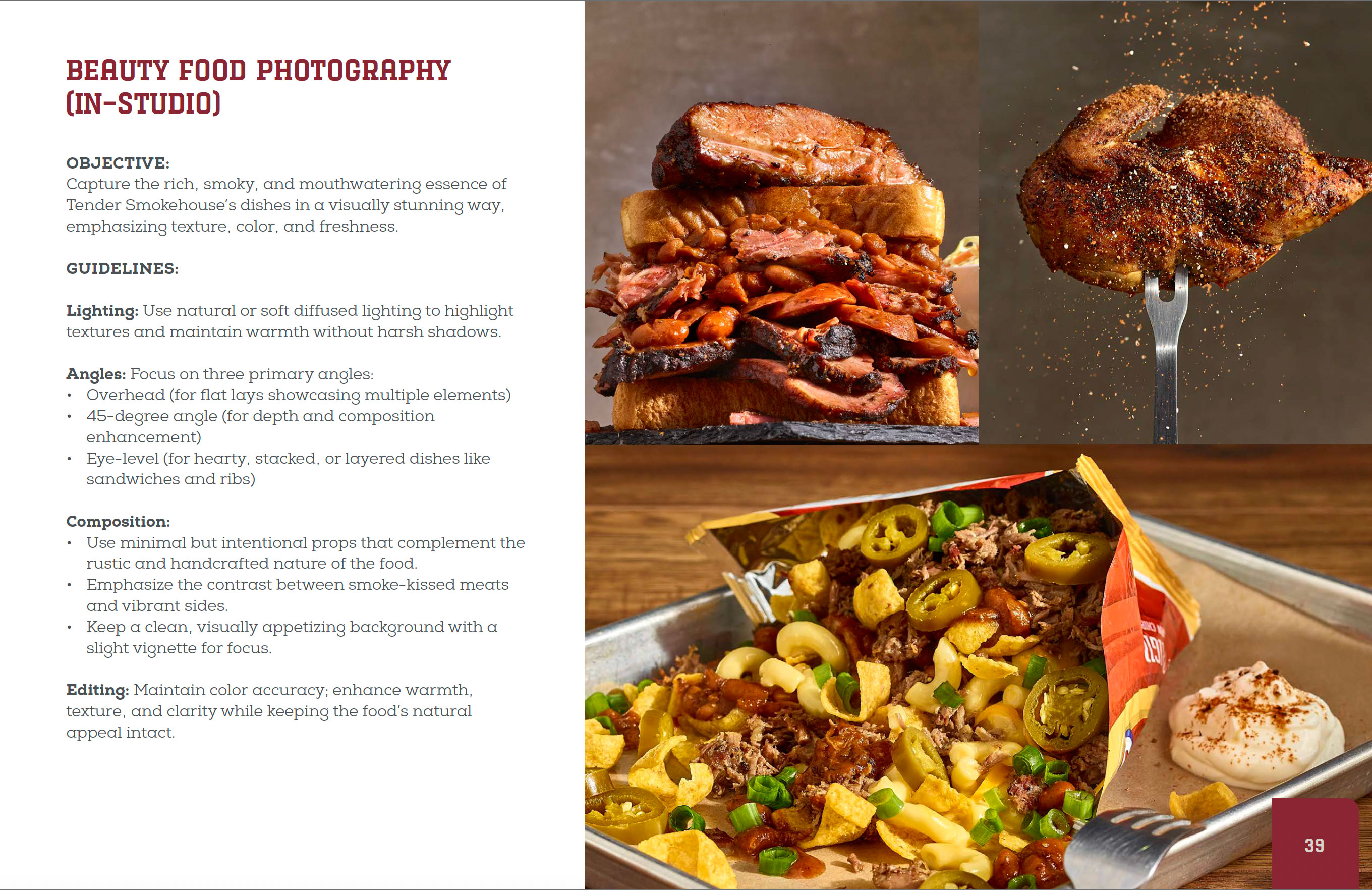
Two shoots, two jobs. Beauty makes the food aspirational. Lifestyle makes the place feel like somewhere you belong.
I directed both, wrote the direction decks, and ran the production.
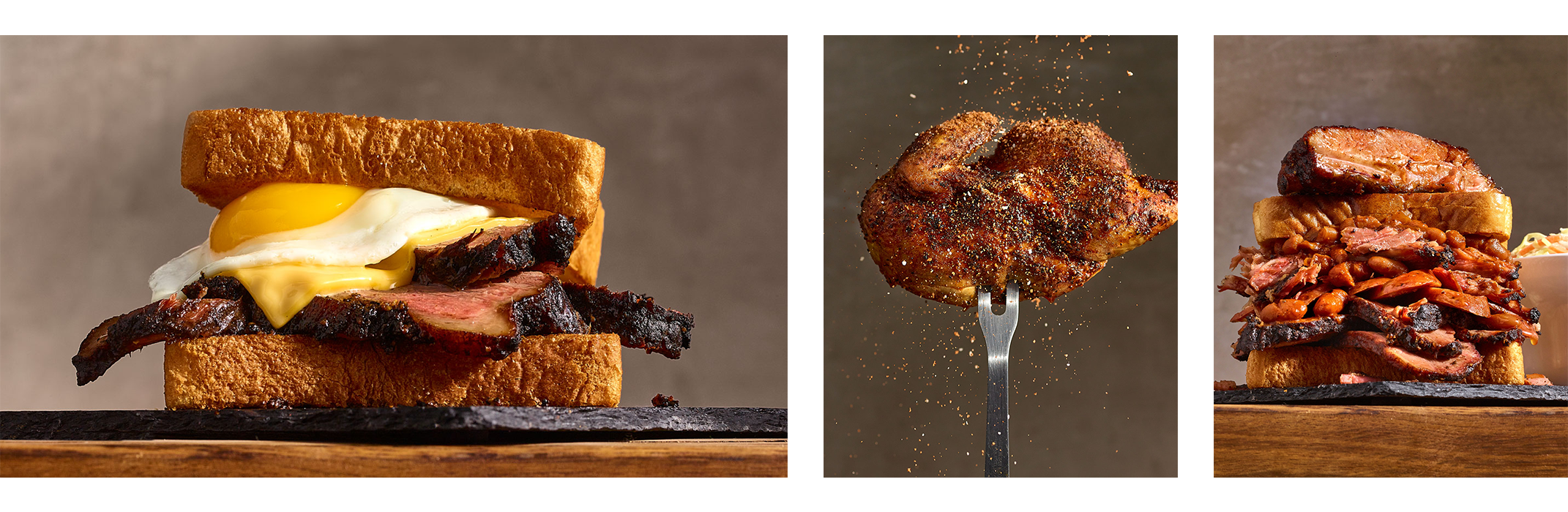
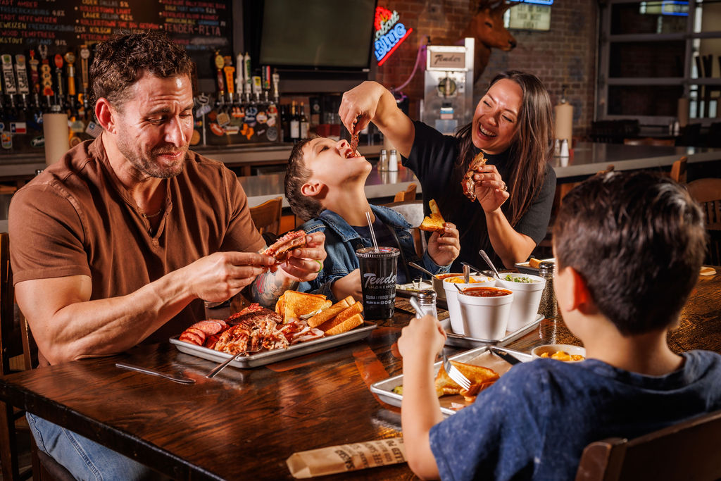
The direction deck went through four versions before we shot. That is not a detour, that is the work. Getting agreement on what a photograph should feel like before anyone books a studio is most of what a creative director does.
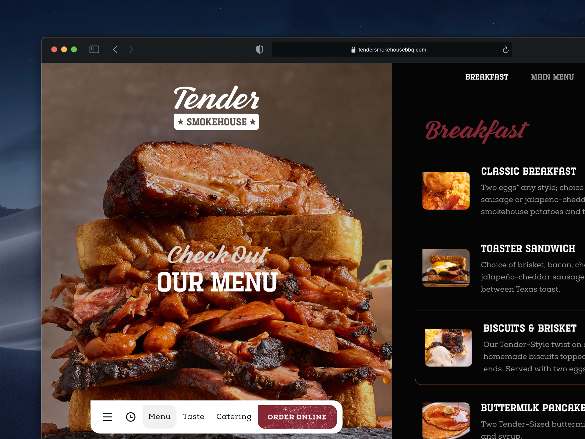
I designed the website and the customer-facing UX alongside the brand system, so the digital experience and the room feel like the same business.
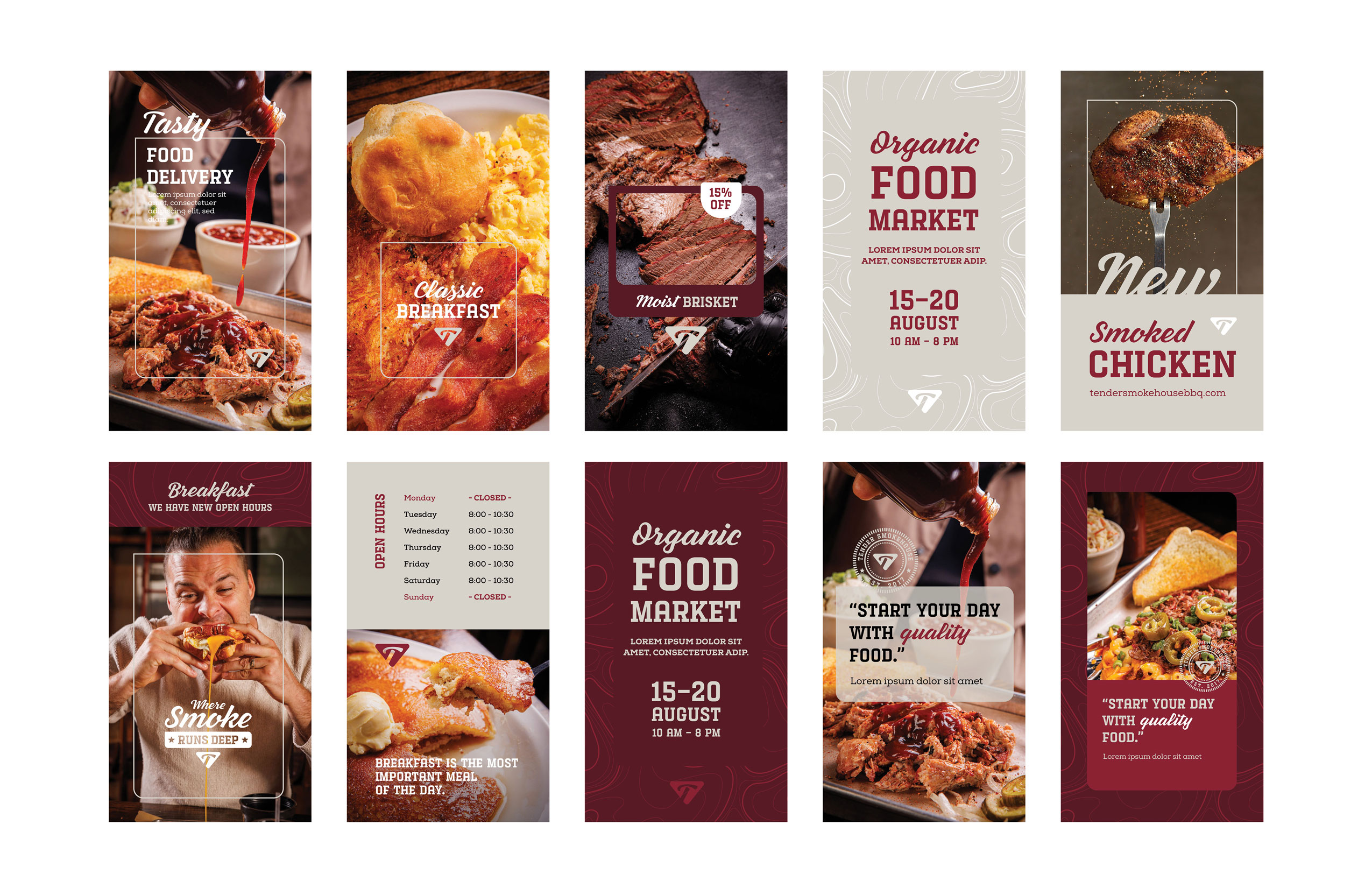

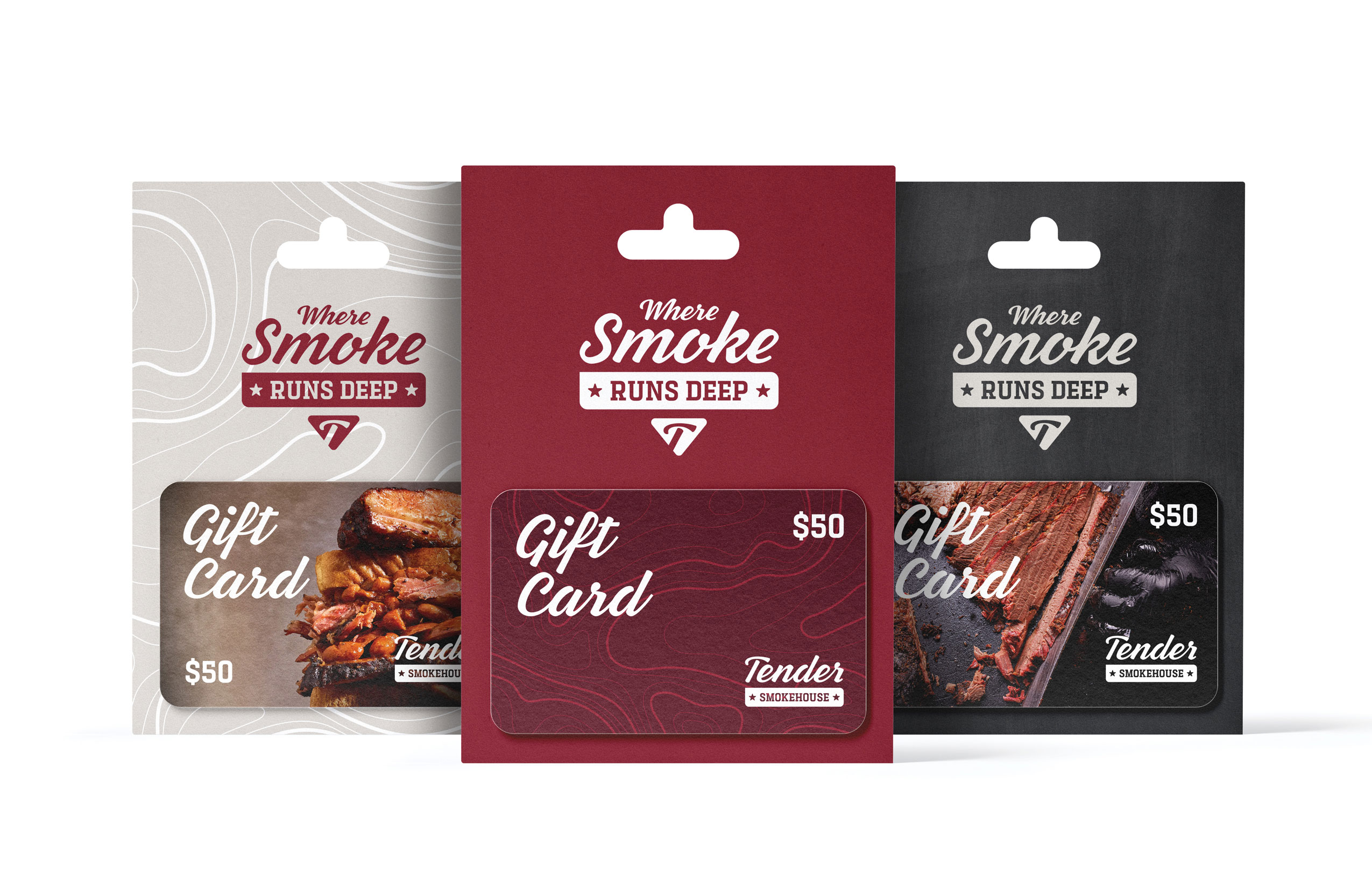
A brand system is a theory until somebody else has to use it.
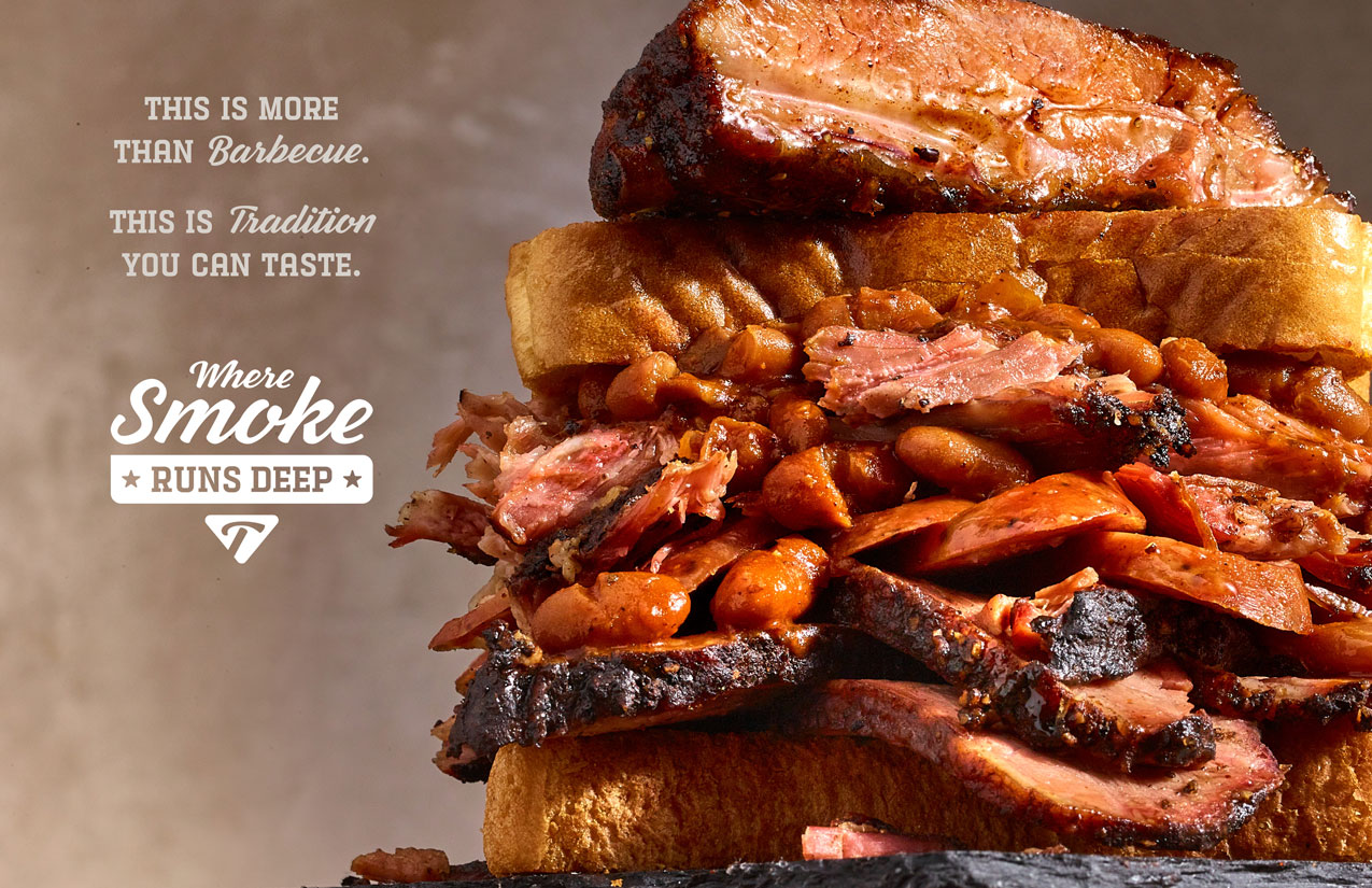
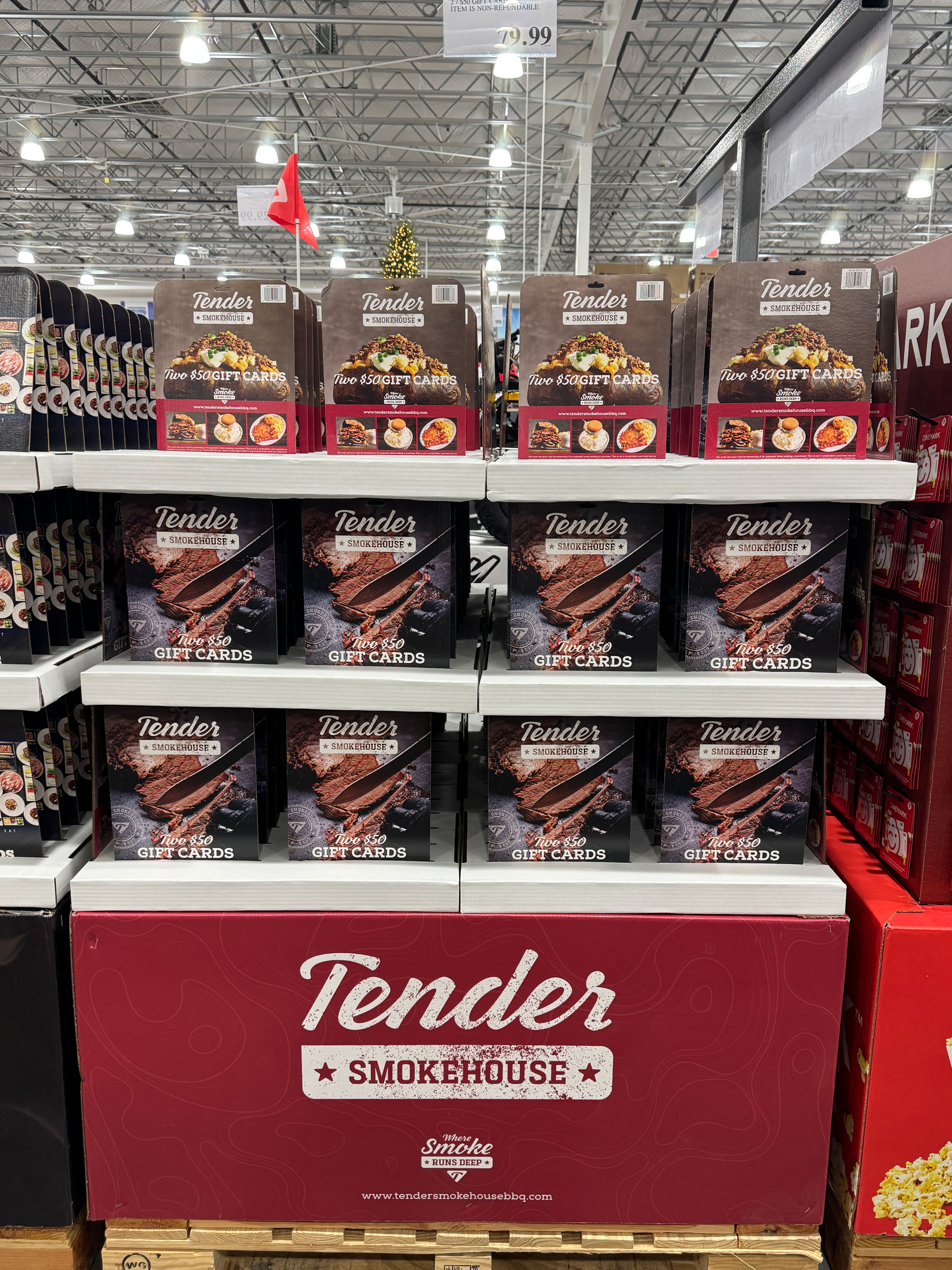
Tender is now in Costco. The pallet wrap carries the wordmark, the starred banner, the Where Smoke Runs Deep lockup, and the topographic contour texture from the manifesto pages. The gift card package uses the same loaded potato photograph that opens the brand book.
One image, doing two jobs eighteen months apart: the opening frame of a brand manifesto, and the thing that makes someone pick a card off a pallet in a warehouse club in December.
Nobody from our team was in that aisle. The guidelines were.
The system now runs across five locations, and my team and I have stayed on to manage social.
Instagram is at 19,600 followers and Facebook at 25,350, with +2,300 on Instagram and +879 on Facebook in the last year. Facebook drove 476,700 views and Instagram 275,500 views against 64,900 reach, with Instagram engagement up 22%. Against Facebook's own benchmarking data, the account sits above average on audience size and at or slightly above average on engagement.
%402x.svg)