Hellmann's turned 100 in 2013. Brand anniversaries usually produce a logo with a number in it and a vague claim about trust.
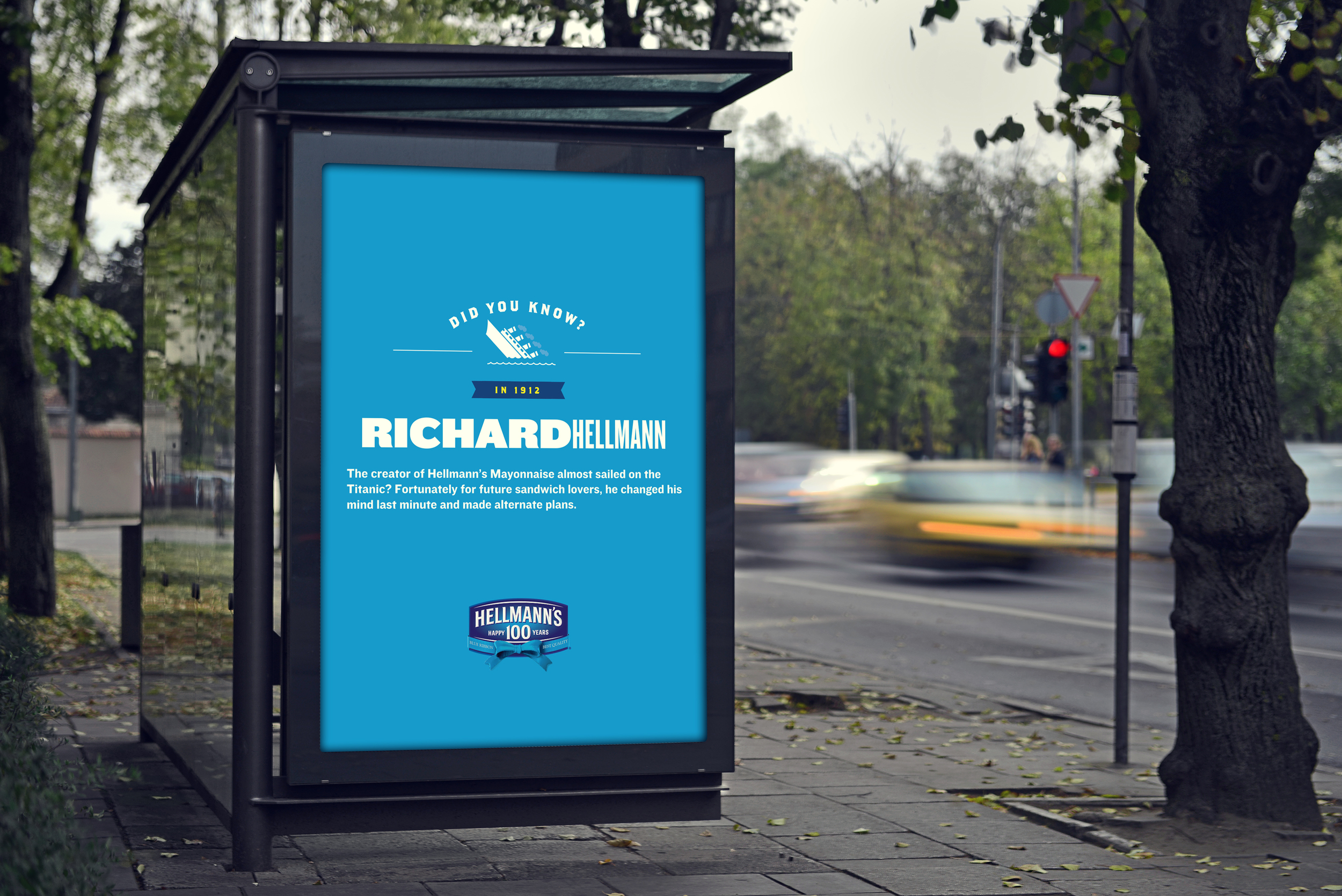
This one took a different position. A hundred years is not a number, it is a hundred years of people eating together. Richard Hellmann nearly booked passage on the Titanic in 1912 and changed his mind. He started with a storefront in New York. The mayonnaise outlived him.
"Bringing the Best Together" became the line, and it had to work in four very different places at once: on global packaging, in every Walmart in the country, on national print pages, and at a live event built around the largest picnic table in the world.
The special edition anniversary identity went onto Hellmann's packaging globally. That is the constraint that shaped everything else.
A mark on a jar has no context to help it. It sits in a different aisle in every country, next to different competitors, printed by different suppliers at different scales, and it has to survive all of it without a brief attached. The anniversary lockup had to feel celebratory without reading as temporary, and it had to sit inside an existing identity that was already a century old and that nobody wanted changed.
What that meant in practice was restraint. The blue ribbon, the 100, the existing shield. No new color, no new typeface, no rebuild of a mark that was working.
I was one of the creatives in that exploration, working through directions for the lockup before the final one was selected, and I executed a number of the campaign's primary assets once it was.
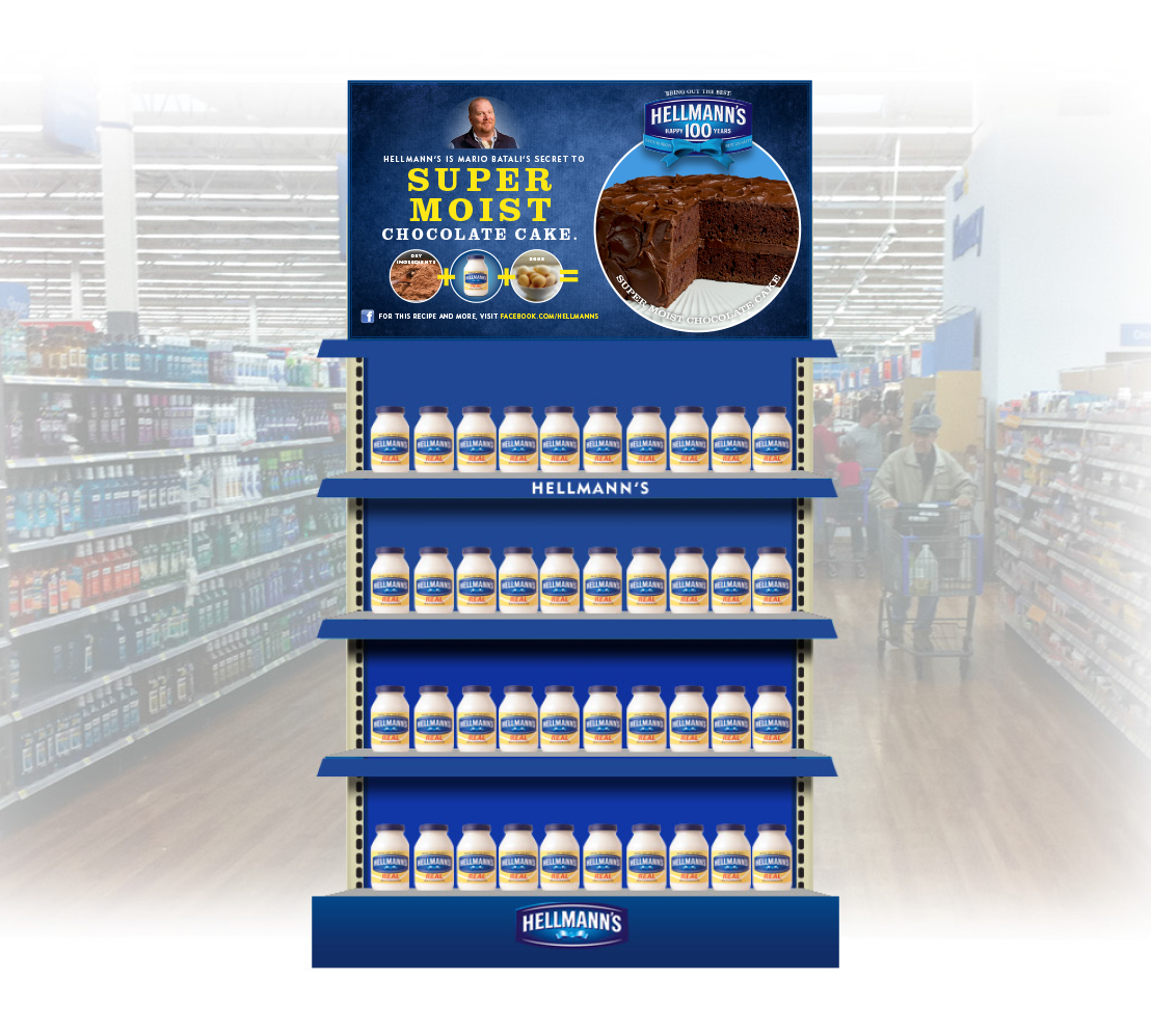
The in-store program ran nationwide across Walmart locations, and retail is where a brand campaign either becomes a purchase or does not.
The aisle changes the question. Nobody standing in front of mayonnaise is wondering whether they trust the brand, they are wondering what they would make with it. So the display answered that instead of repeating the campaign line.
The endcap carried a recipe mechanic: dry ingredients plus Hellmann's plus eggs equals a super moist chocolate cake. Three icons, two plus signs, an equals sign, and a photograph of the result. It reads from down the aisle as a cake, from a few feet away as a recipe, and from arm's length as a reason to put the jar in the cart.
It also had to survive production. A display is manufactured by someone who never saw the brief, assembled by a store associate at six in the morning, and refilled by a third person for weeks afterward. The structure had to be simple enough that none of them could get it wrong, in thousands of stores at once.
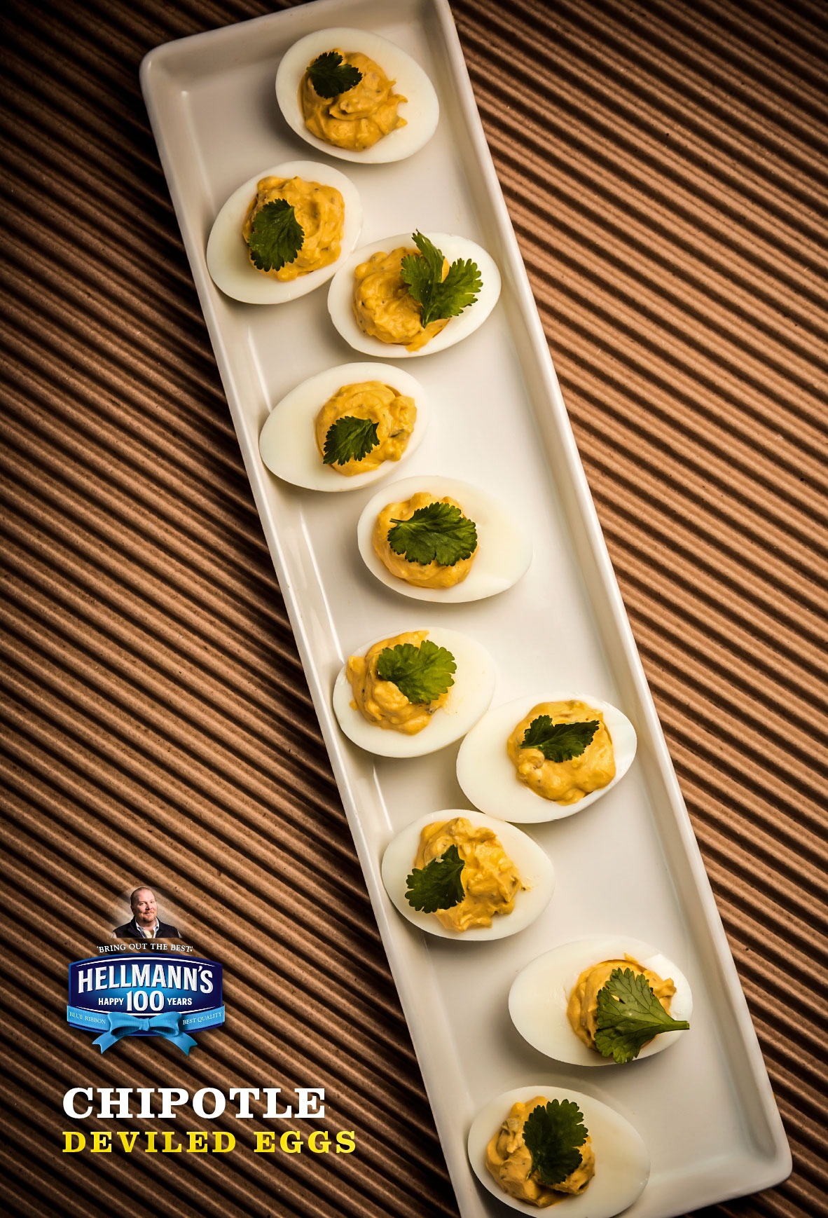
Lobby duratrans ran backlit and floor to ceiling, viewed from across a room.
That distance kills detail, so the series stripped down to one rule: a single dish, shot overhead, type locked into one corner, nothing else. Three executions, one template. The system lives in the repetition, not the variation.
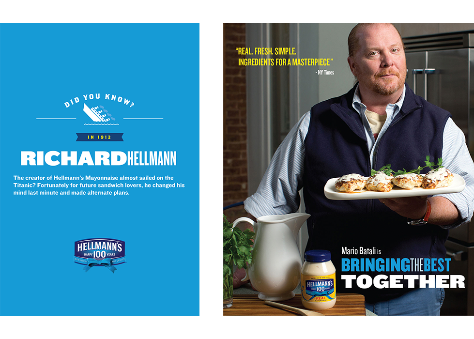
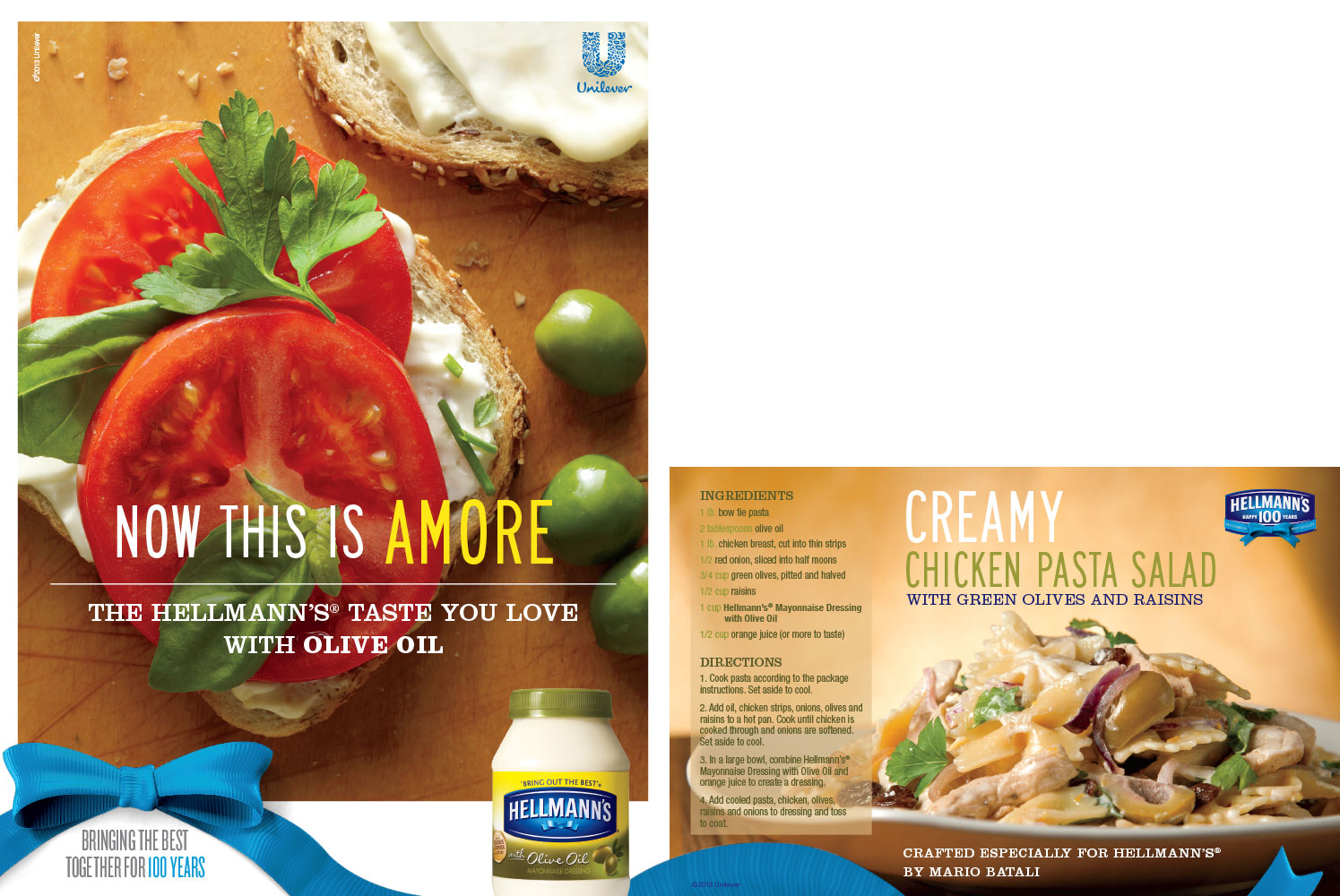
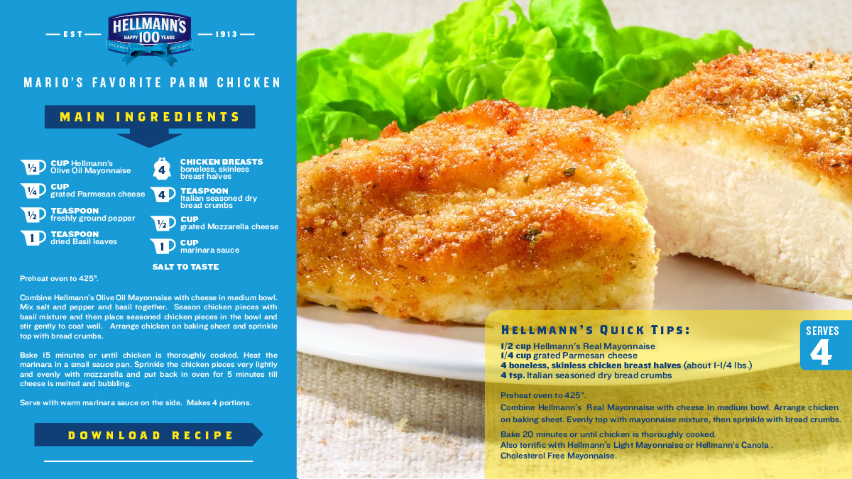
The campaign extended into a branded content partnership with Mario Batali and ABC's The Chew, built around updated takes on classic Hellmann's recipes across a recipe book, a video series, and digital content on Facebook and YouTube.
Branded content has a specific failure mode: the brand shows up as a logo bug and the content has nothing to do with it. Here the product was the mechanism of the recipe rather than a sponsor of it, which is the only version of this that holds up.
The experiential activation built the world's largest picnic table, which is a literal reading of "bringing the best together" and is better for being literal.
A hundred years of a condiment is an abstraction. A table long enough that strangers have to sit next to each other is not.

The anniversary logo is on every piece in this campaign and is the least interesting thing in it. What held it together was deciding what each surface was actually for. A jar is not a billboard, an endcap is not a poster, and a picnic table is not an ad. Designing as though they were the same is how campaigns fall apart between the deck and the store.
